|
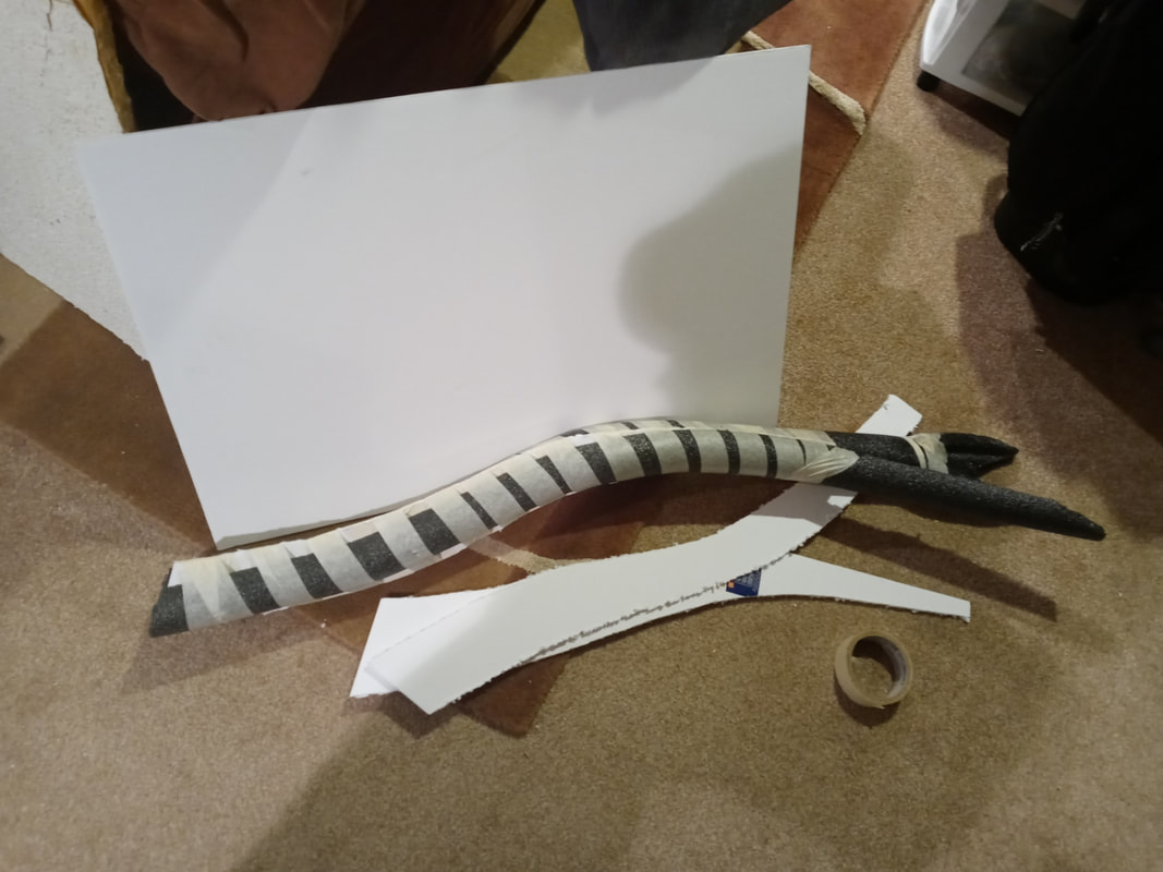
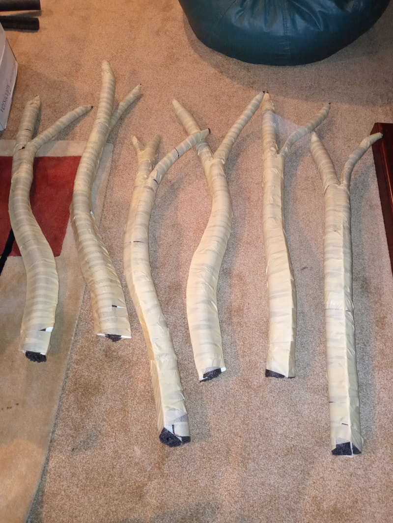
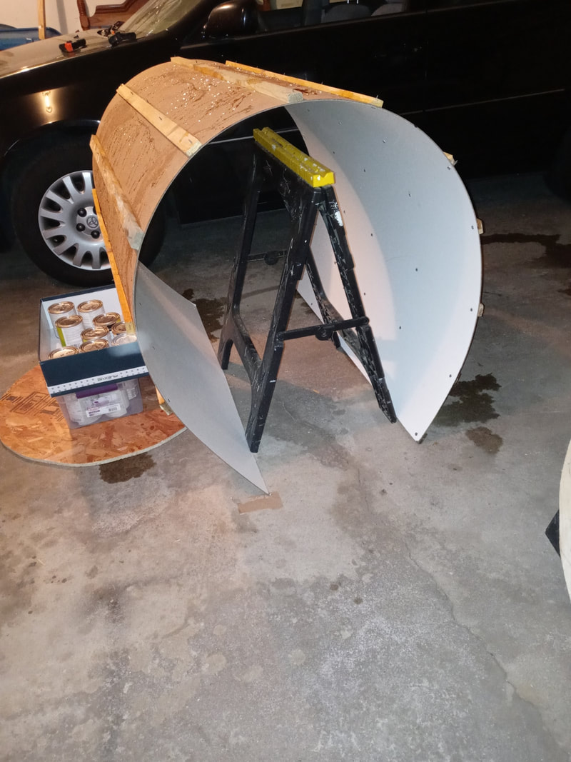
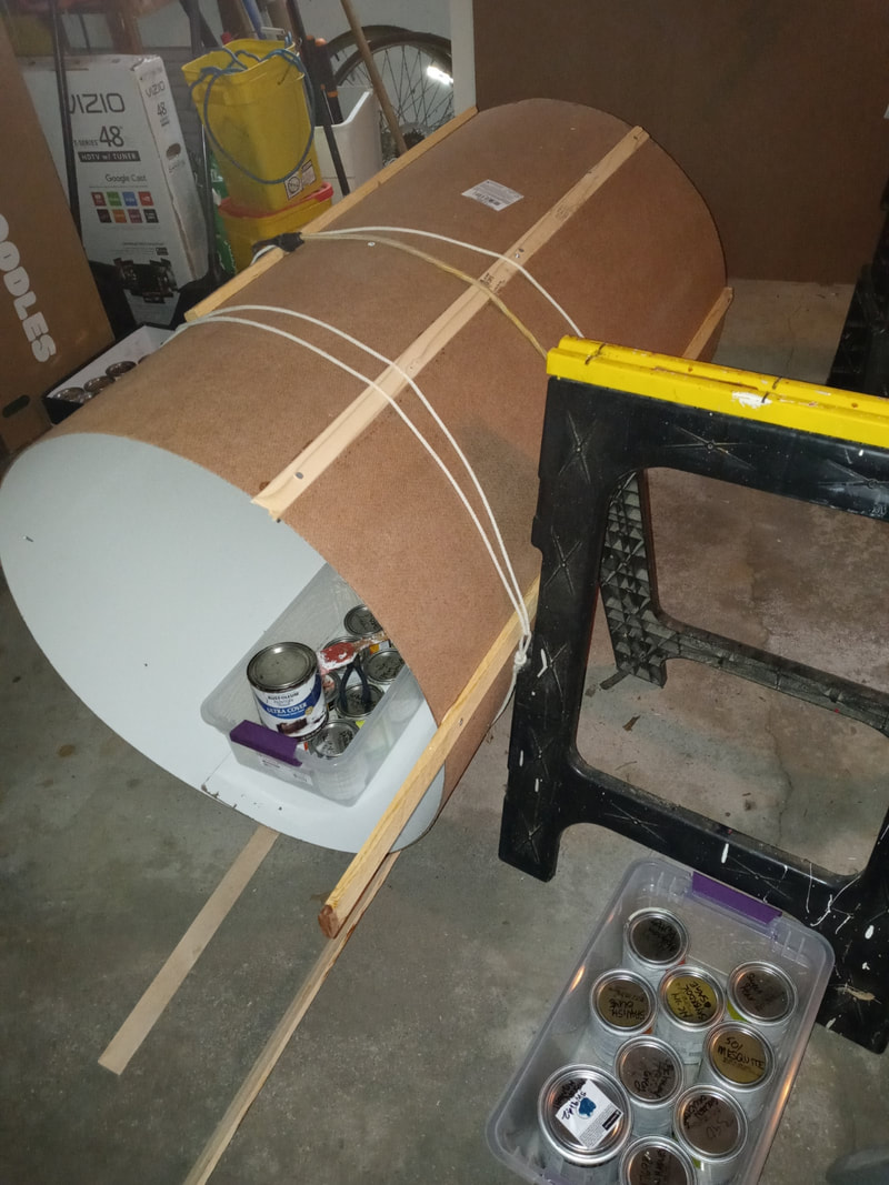
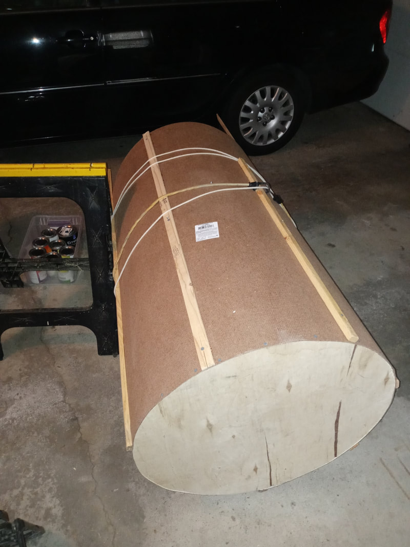
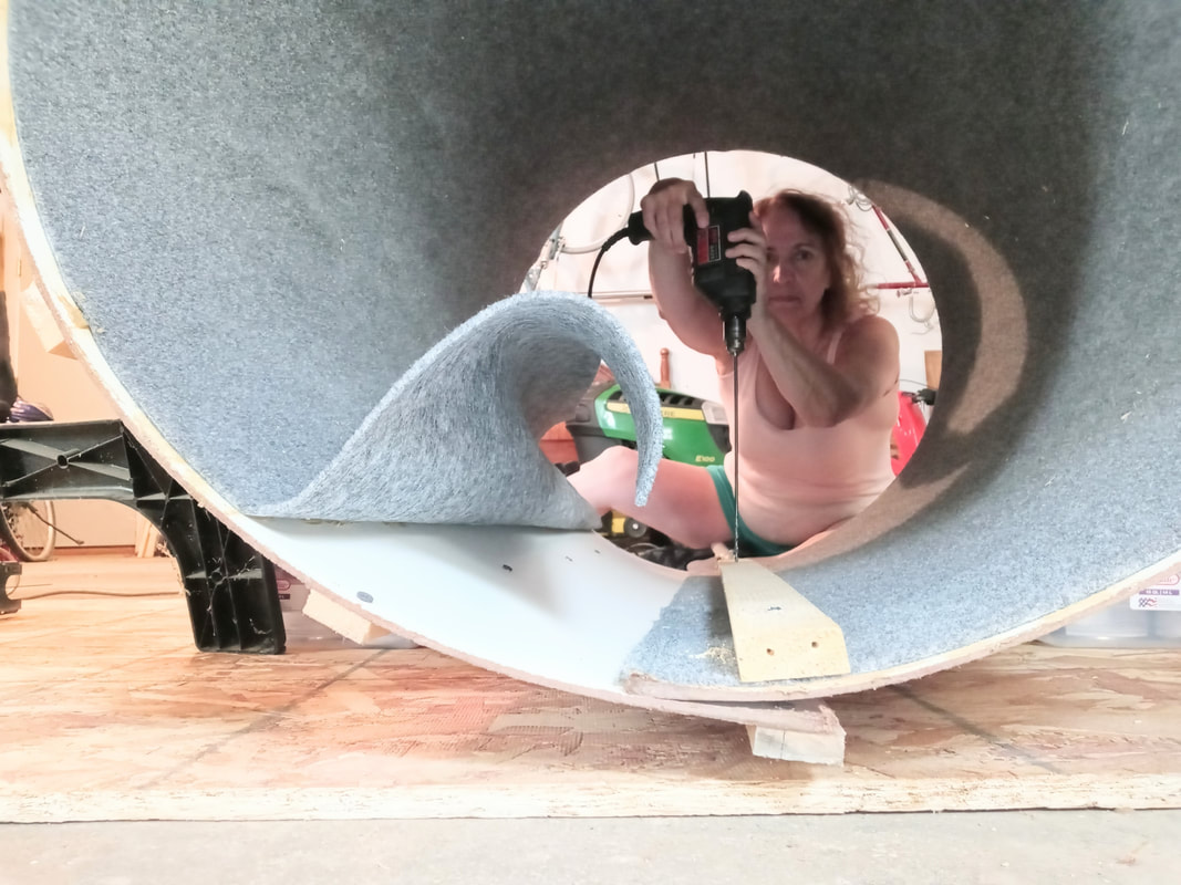
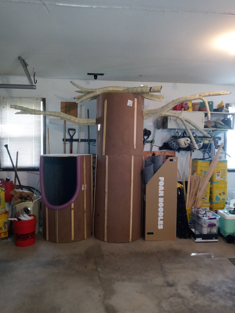
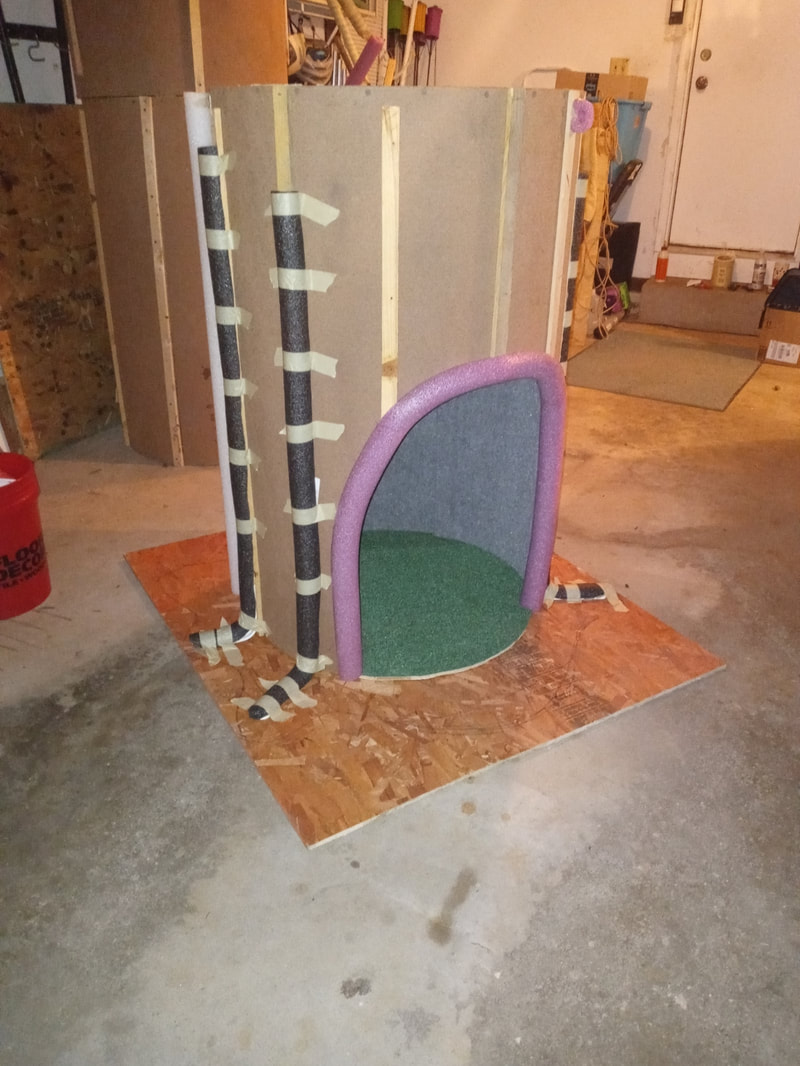
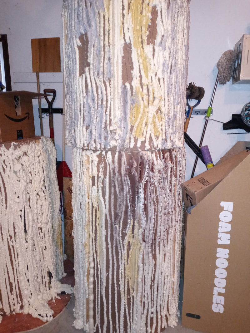
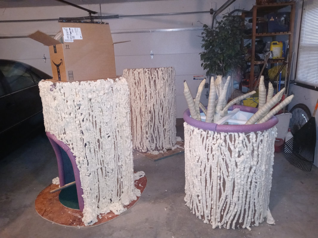
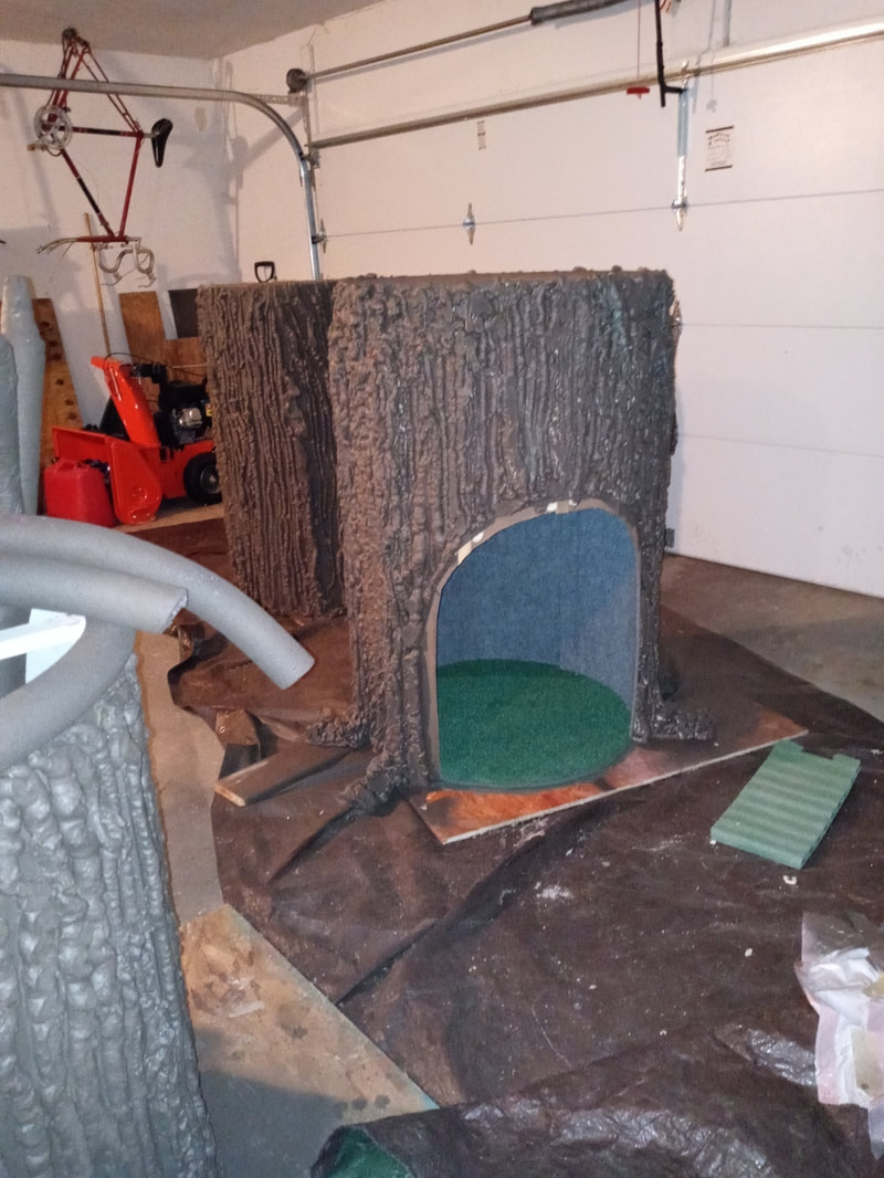
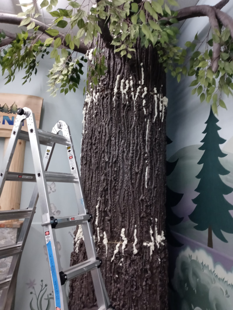
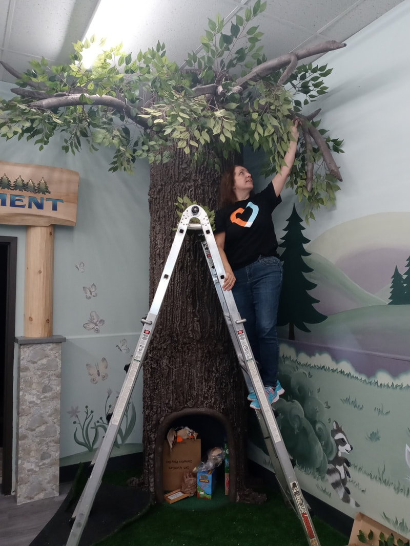
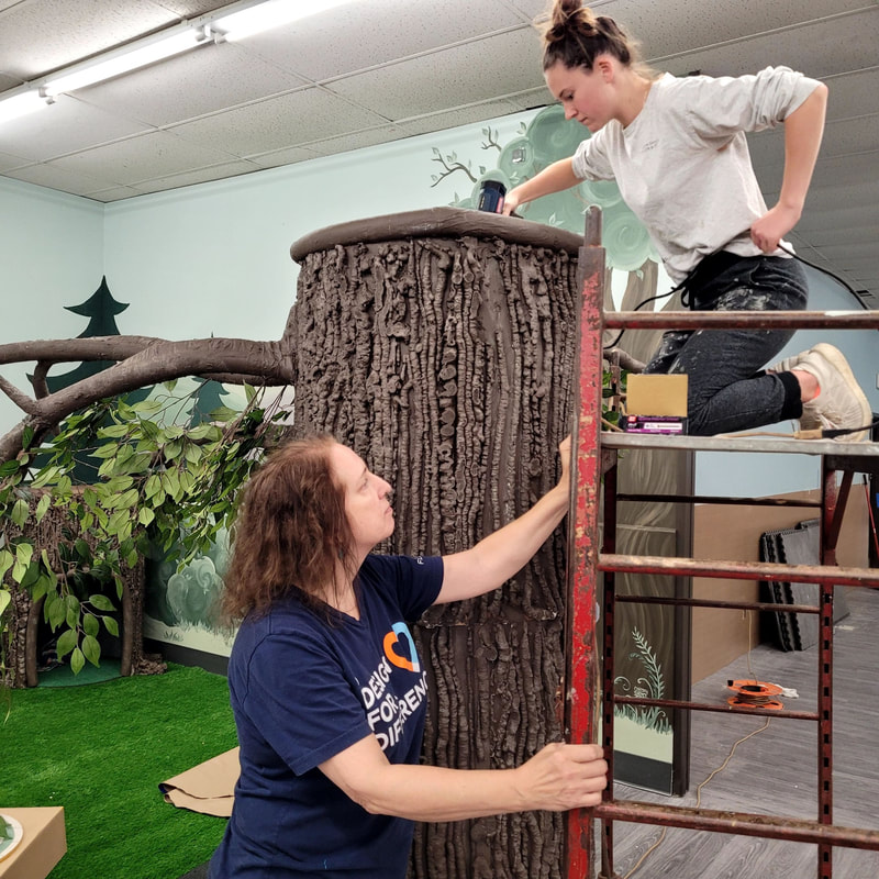
It's been a while since my last blog post. I've been building a tree! Why? What? Are you crazy? ...you ask! This was not just any tree. It was a little hideaway for the students (and staff!) at Common Threads Family Resource Center in Madison, Wisconsin. As a design team member of the Design for a Difference movement in Madison, I chose to spend a lot of my summer and the start of fall bringing nature (an 11 foot tall tree to be exact) to one of the spaces where Common Threads will bring students for sensory exercises and a chance to calm themselves. This is not my first contribution in the creative build department for a non-profit. I built a very large wall clock for the Wil-Mar Neighborhood center in 2019. 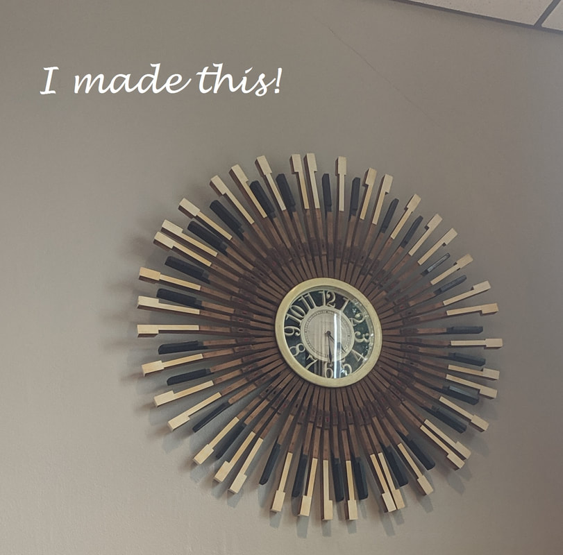 Common Threads is a non-profit organization that brings many services to neuro-diverse individuals. They have a school program and a clinic that serve this special community via staff that are professional and so very kind, loving, and talented. They deserved the great makeover worth approximately $450,000, fully donated by designers, trades, and others providing materials, time, and definitely talent. The space I helped pull together is called the 'alcove', a space off the main cafeteria area which leads to a quiet 'take five' space designed by another team. There were several teams that worked together to provide great spaces for the students and staff. There is a short video of the reveal at this link. For this blog post, I wanted to share my work on the tree itself. A bit of a departure on interior design? Yes. Once I committed to creating a tree, I worried all along whether I'd be able to pull this off on my own. I had offers of help, but bringing others in didn't fit into my schedule so I plodded along and surprised myself in the end. I'm proud of the result and kind of miss my tree now that I've handed it off to Common Threads! Let's start at the beginning. I built branches out of foam core, pool noodles, and a lot of masking tape. The bigger task at hand was the main trunk. How do I build something that I can transport and put together that ends up being 11 feet tall and has a large enough space within to seat one child or adult? I decided three sections will work given that the material I used was 4x8 sheets of hard board formed (not easily, mind you) into cylinders. I had to ensure it was stable enough for students that might be a bit rambunctious before they are able to calm themselves. I added wood slats to the outside, wet the hard board slightly, then used ropes and other supports to get the ends to meet. I added plywood at each end of the two bottom sections and on one end of the shorter top section, plus some wood boards to keep it pulled together. I wasn't convinced that would work well with the strong resistance of the boards and the tiny screw heads, so I added several toggle bolts and wood boards along the seams to ensure more surface was covered to keep the cylinders closed and sturdy. I lined the bottom section with indoor/outdoor carpet generously donated by The Home Depot along with most of the supplies for this tree. This hard board fought me hard! I must have drilled my fingers 3 or 4 times getting the cylinders built. There was a scary time when I cut out the hide-away opening because I wasn't sure if it would all snap apart. It worked well even doing it after I lined the inside! My garage housed the tree and all my supplies for a couple of months as I worked on this. I added the branches temporarily to ensure I could do it and that it looked like a tree. (Bottom section is shown upside down.) Time to start adding shape and texture to the cylinders. Again, pool noodles to the rescue along with a couple of cases of expanding insulation foam! I also used Durham's Rock Hard Putty and leftover ready mixed joint compound to fill in the gaps left by the foam. When I realized I would need buckets and buckets more of this stuff, I just stopped. The majority of texturizing happened on the bottom cylinder. I started painting by hand, then moved to using my paint sprayer (duh! should have started with that!). I finished up with more hand painting as there were still lots of groves to cover. Finally, after finalizing how this would all get put together, I realized that there was one doorway I hadn't measured to get this into Common Threads! I held off tears until I could measure. I originally had an extra base of plywood that the tree 'roots' expanded onto, but thankfully all I had to do was remove that to get it in the door. This could have been a terrible mistake on my part, but it worked out fine. 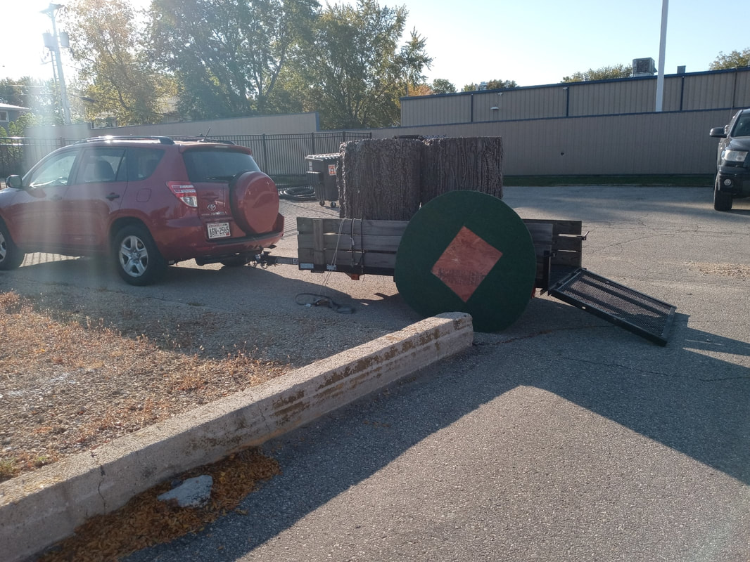 Onsite after a test measure, I added the branches before putting each cylinder in place again. Then added more putty and foam to texturize the seams and finally lots of paint touch ups. I had the help of many to get this secure and in place. It was hard work, but well worth it. Adults and kids tried out the hide-away space and we all agree it is comfortable as well as enchanting. 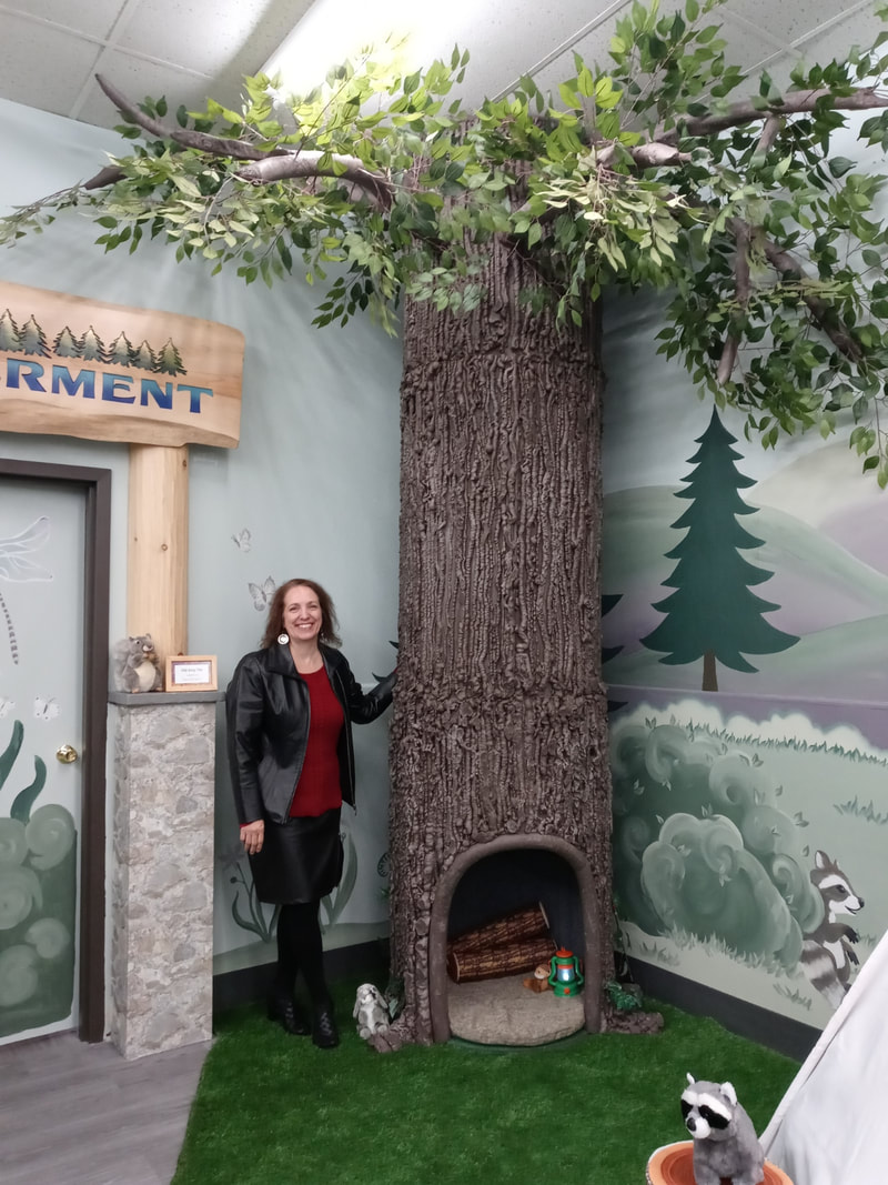
0 Comments
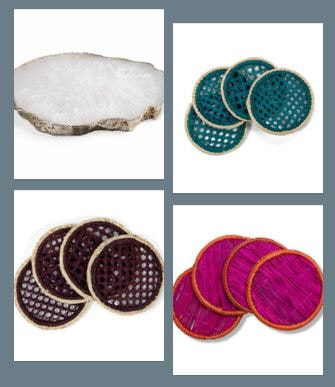
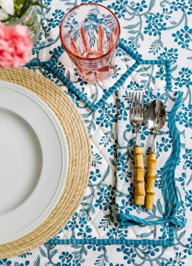 Don't you just love dining al Fresca? There are some beautiful table linens and coasters that work well in an outdoor setting. Click on the pics below to see a few options I found to be unique and stylish. The perfect way to use your tableware is by experiencing these refreshing mocktails from Nat at The Mindful Mocktail. Here are two of my favorites. Enjoy! Ginger Mojito Mocktail
Piña Colada Mocktail Recipe With Only 3 Ingredients
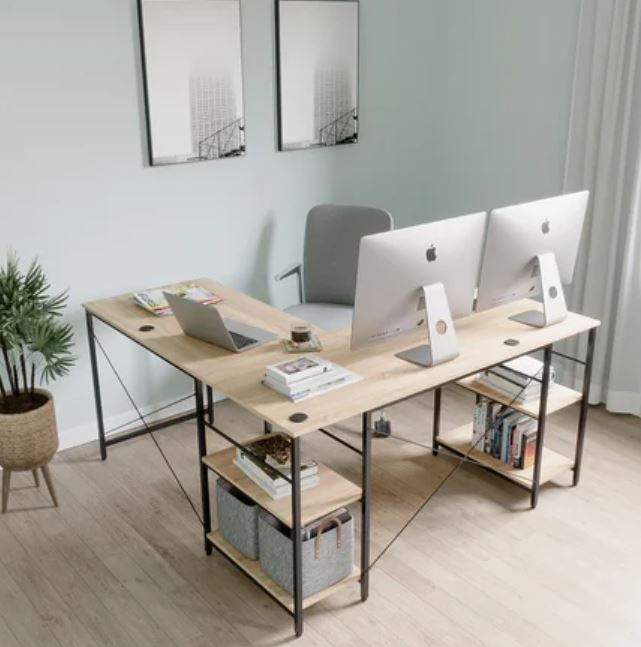
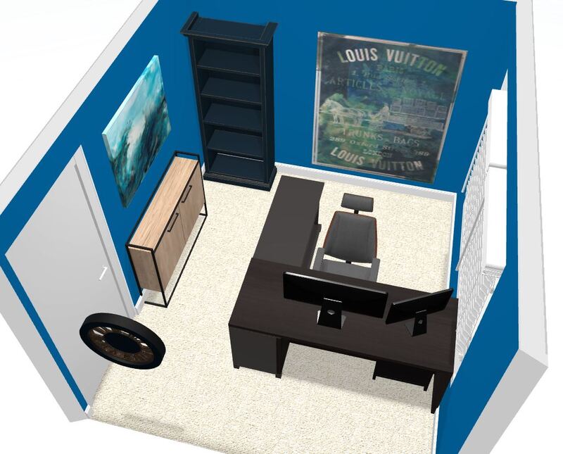
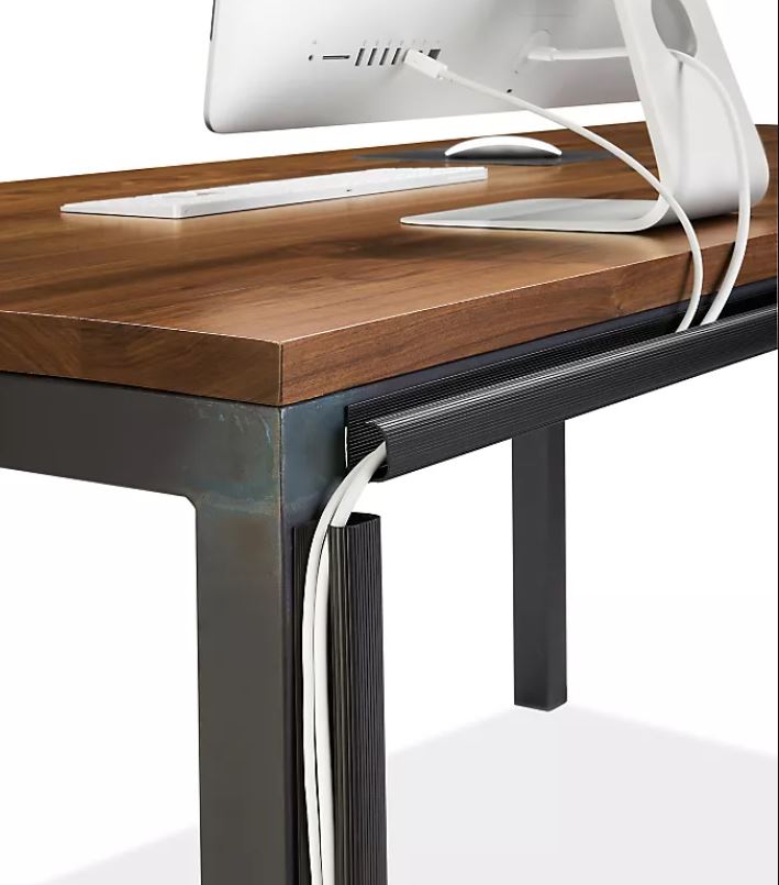
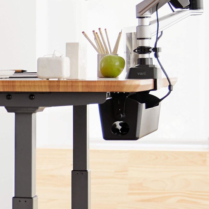
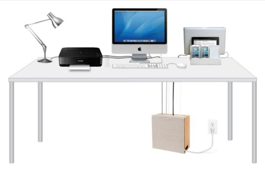
Do you have a corner desk in your home office? Is it facing the corner? That may seem like a silly question, but really, who puts baby in the corner?! 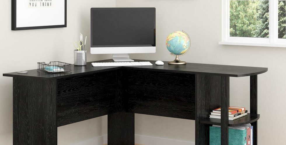 A desk like the one above (available at Target) may work well in the corner, but what does it do for your esteem? Wouldn't you rather feel like you are at 'command central' facing the world head on rather than the corner walls? Do you want the first thing you see when you walk into the room to be the underside of your desk? Take a look at the layout and examples below for an alternative that just may increase your productivity and creativity, as well as your self esteem. These corner desks face toward the door. One Feng Shui principle for a home office is to place your desk in a position of power. You can view who is coming in and also take advantage of the natural light entering the room without adding glare to your computer monitor(s). One challenge with this layout might be the endless amount of cords you have to have for all your components. You don't want to see spaghetti when you walk into the room, so organizing your cables is key to a tidy and professional look. Here are some great ideas for getting control over those cables...click on the pics for links providing more information on the products. This is just one dilemma some of us face. Let me know what design dilemmas you have and I'll get straight to work on a solution for you.
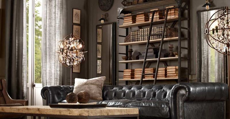
At the beginning of this year, this picture represented my prediction for interior design trends. 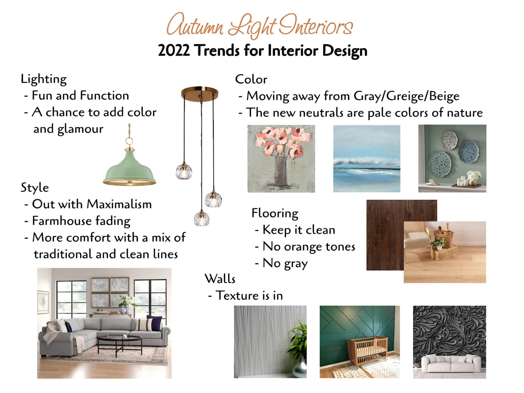 Thanks to my latest clients and my daughter's interest in unique corset tops, I started looking at the Steampunk genre and how it can apply to our interior décor. I modified my 2022 trend mood board to explore that very idea. It's a little darker, a little shinier, and a whole lot more dramatic. I like it. Do you? 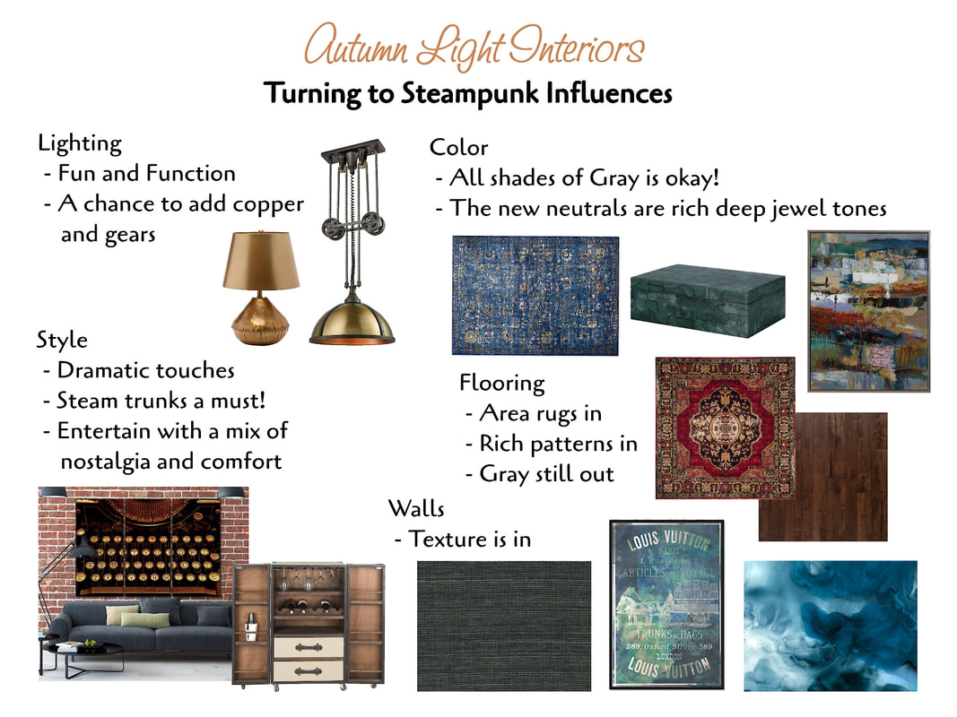
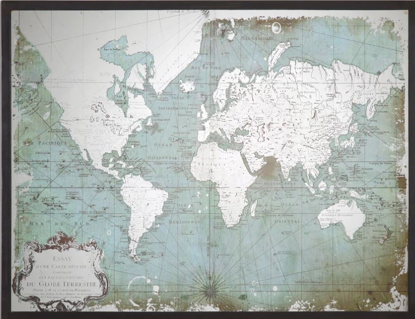
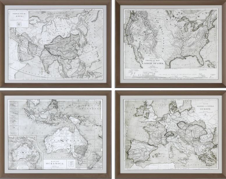
For lighting, I'm still seeing the mash up of fun and function. The gears and cages in industrial lighting emphasize both concepts. Colorful Tiffany style lighting brings in the Victorian scene where Steampunk is often based.  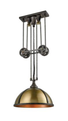 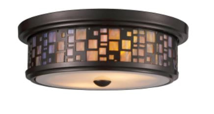 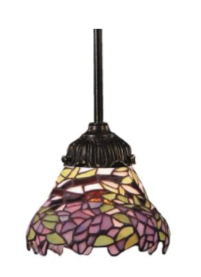 The colors and textures are from the Victorian era - deep jewel tones, velvety richness, and very tactile wall coverings be it grass cloth, murals, or any fabric application. Accessories can be used to corral small items or be purely decorative. Our iceberg filler (ball) is reminiscent of a hot air balloon. The theme of travelling all ways is another underlying Steampunk concept, so don't forget decorating with maps.  Believe it or not, this is on a shower curtain!
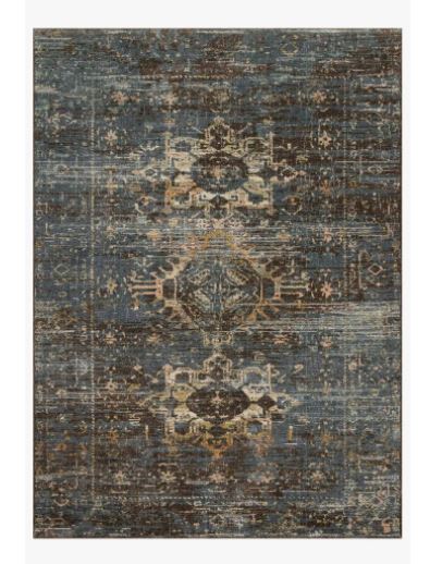
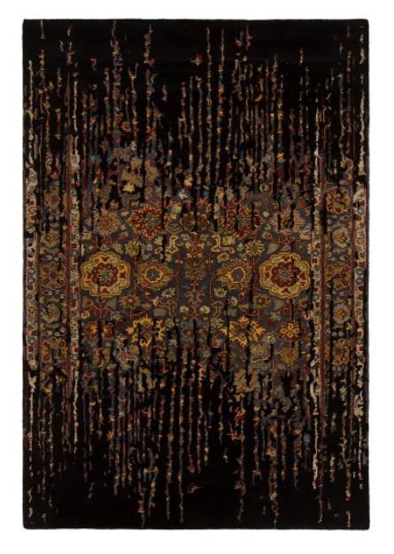
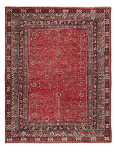
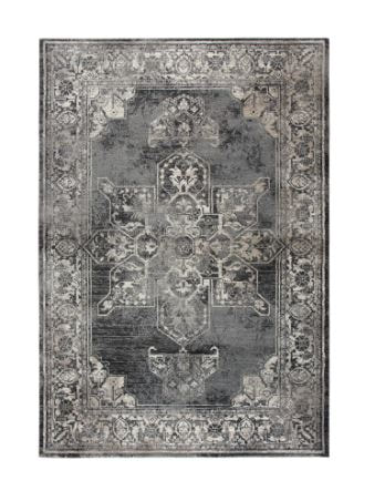
The wood flooring is more rustic, but the area rugs are decadent. Fading is acceptable and adds to the well travelled look. The overall style is quite liberal to the individuals' preferences. It represents a historical view, creativity, science, romance, and mystery. What more can one want! Steampunk style leans toward maximalism, but can be interspersed throughout other styles - Victorian (of course) and Mediterranean styles can take the layers of rich color and added trinkets. Industrial, Farmhouse, and Rustic Southwestern are good baselines for rustic wood expression. Mid-Century, Scandinavian, and Coastal are harder sells, so I won't go there! Oh why not! Add a bird cage pendant light and a rustic steamer trunk table to your Coastal vibe and I think you will have a one of a kind look that blends the ocean scene with a slight node to Steampunk. 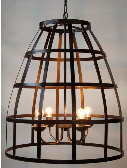 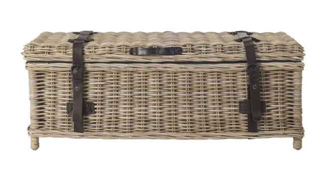 I hope this trip down a different path from my usual stylings gives you a worldly perspective into the many faces of interior design. It's art with function. Or is it function as art?
Do you remember the commercial where 2 clients present an architect with a faucet and say "Design a house around this!"?
What a challenge! It can be done. Many times I take inspiration from things around me in order to design a space in someone's home. This next picture are favorite items from a home owner gathered together for the purpose of getting to know her before designing a kitchen and dining area. 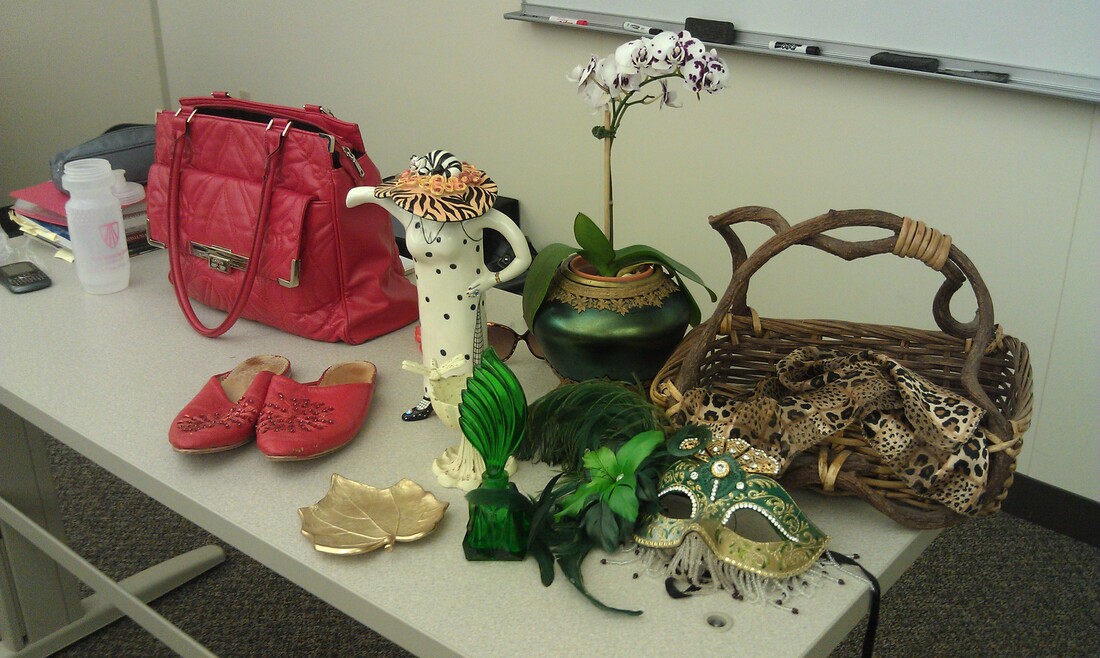
What’s important to the home owner?
History and stories from the past Sharing time together with friends Warmth Unique conversation pieces Functional, Elegant, Friendly Imagination Clean lines with pops of silly The view rules - Nature, trees This was the jumping off point for creating a color and texture scheme.

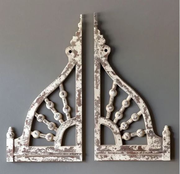
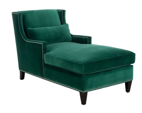
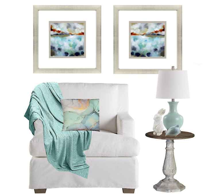 When deciding on furnishings for a space, there is often an unused corner that begs for an inviting seating arrangement that will serve as a spot to relax or as additional seating. Have you ever wondered how to choose the right furniture and accessories to bring a corner to life? Continue reading for a step by step approach that is full proof in pulling together an inviting look that everyone will be fighting to call their own. 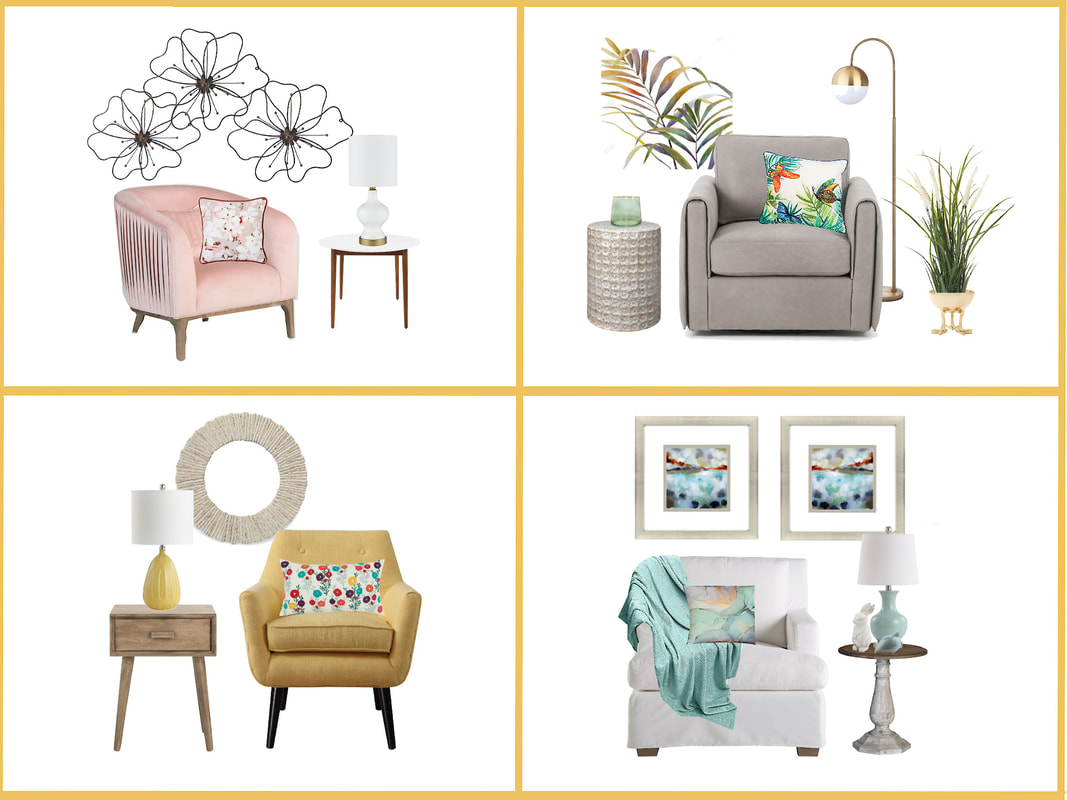 Here are the building blocks to get you started:
 Photo by Ivan Samkov from Pexels Every now and then as an interior designer I'm asked for advice on how, when, and/or whether to downsize. At any age, this can be a difficult decision. Often times it is the adult children helping their senior parents work through that decision. Lydia Chan has provided some advice in the following article written for my blog this month. For additional information and resources especially for caregivers of Alzheimer patients please visit her website at https://alzheimerscaregiver.net/. The article itself has several links to great information! Thanks, Lydia.
Let's start the new year out with two topics that when addressed can bring you a sense of calm and order - Creating a focal point and practical, beautiful storage ideas. I set out to write up all my ideas on these topics, but decided no one really wants to reinvent the wheel, including me! So here is a link to a brief article on finding a focal point which is the first step. I'd like to add to that list! Adding a great light fixture over a counter, a bed, a desk, a seating area, or in your hallway can provide that eye catching item that is both functional and fun. Here is my collection of lighting that I hope inspires you. 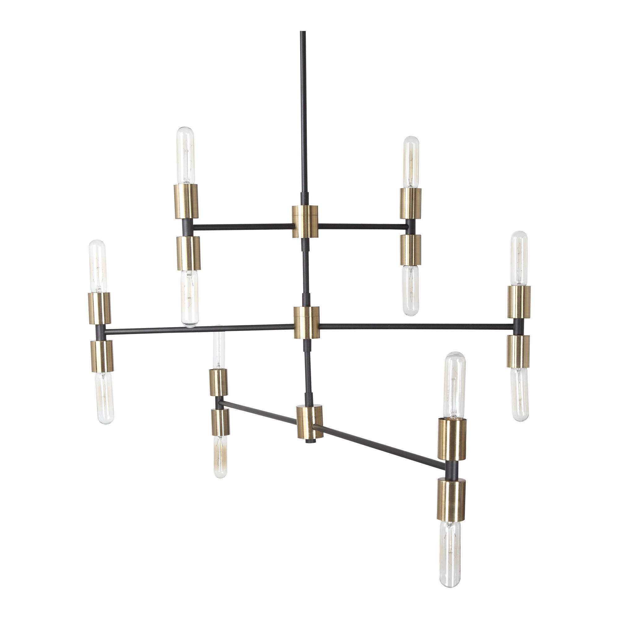 And now for your storage needs! I love a good IKEA hack, don't you? Take a look at these ideas from House Beautiful. I'll be keeping my eyes out for unique storage vessels. I love the variety of basketry shown in this pic. 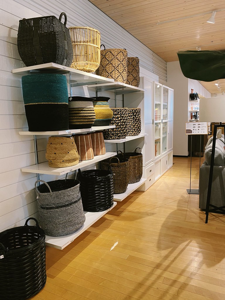 Stay warm and, as usual, I'd love to hear your ideas on the topics presented.
When you have been using your space 'as is' for a long time, it can become outdated and messy. No matter what the reason you've left it that way, whether it be a lack of funds, priority, or time, it can become a surface to collect clutter rather than a destination. Let's change that by re-imagining the space using items you have in other areas of your home. 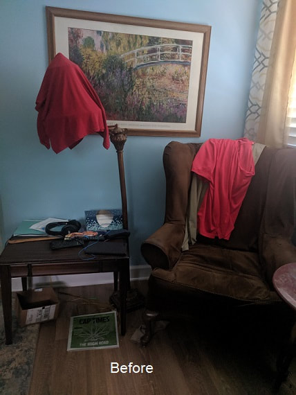 Start by searching your home for unused items or items that you think you may want to change out and gather them into one area to see if a theme evolves. You may decide to put them right back, donate them, or move them to the space you are trying to re-imagine. Do what works for you! 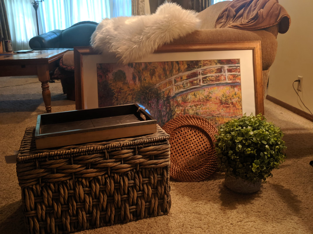 The biggest change to re-imagining a space starts with a clean up, of course. If you can start with a blank space, great! If not, look critically at each piece and imagine replacements that might be possible or pieces from other rooms that will compliment what you have. Changing out the slipcover on furniture is a quick fix. If you don't have a slipcover for an existing chair, perhaps a chair pulled in from another room will add brightness to the space. Add a cozy throw over the back of it to invite you to sit and relax. An under utilized woven storage box from another area of the home can help keep clothing, books, DVDs, etc. hidden away, but close at hand when needed. Add "bun" feet to the storage box to raise it to table level. They can be purchased online or from your local big box hardware store and stained to match other décor. Add a tray on top to corral books, a vase of flowers (or other plant), and to provide a level surface for your favorite beverage. Add a light over art (not shown) to eliminate the need for a floor or table lamp which both take up valuable surface space. Finally, add a softly textured area rug for comfort and a touch of luxury. 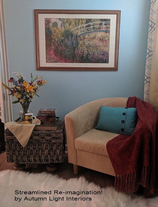 Room Re-Imagination! is a service I offer to help home owners and renters get a designer look without purchasing new furnishings and décor. Purchase a Streamlined Room Re-Imagination service by clicking here.
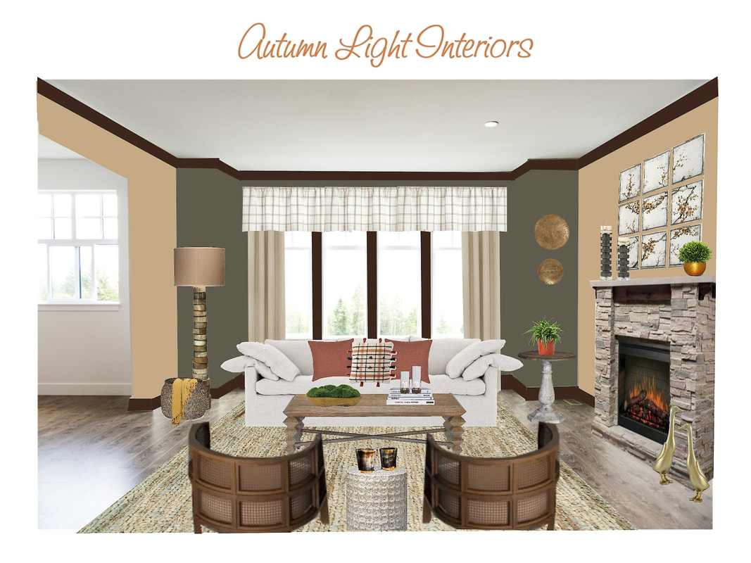 Bring the warmth and timelessness of Cozy Vintage Cottage décor to your space. Add texture by layering in colors from nature (moss, mushroom, and wood tones) along with plants, brass accents, and soft furnishings. Crown molding in a dark stain frames the room just like you would frame a picture capturing a special moment in time. Repeat patterns for a sense of familiarity as shown in the curves in the chairs and side tables, basket, wall art, and floor lamp. Also repeated are the squares in the boxy check of the valance, the chair structure, and the art over the mantel. Finally, cottage décor would not be the same without adding whimsy as I did with our brass duck sculptures enjoying the warmth of the fire!
|

Photo by Miriam Bulcher Photography
Meet Your DesignerI, Brenda Szarek, am the founder of Autumn Light Interiors. I have immersed myself in home design and problem solving for years and have creative solutions for all kinds of interior design dilemmas. I hope you enjoy my tips, tricks, trends, and inspiration to help you find your way to a well-designed, comfortable, and functional home you can be excited to live in and welcome others within. Archives
July 2024
|


 RSS Feed
