|
Yes, that is the question! There will be strong opinions in this area, I'm sure. Over the years, my opinion has changed and as an interior designer I recognize that it all depends on the look and feel you want your home to exude and how much of the true original character of your home's style you want to keep. That said, this blog is not to tell you what is right or wrong, but to show you how painting or not painting impacts your style. You can then make a judgement on whether to preserve that style or not.  There are various classical styles that raise natural wood to the highest level - Craftsman, Mid-Century, and Tudor to name a few. The stain can range from very dark to very light. All of these do not favor painting your wood trim. I've seen a whole lot of builder basic wood trim from 70's through the 90's (and I'm sure beyond!) I don't feel badly about recommending painting your basic thin baseboards for an up to date look unless it is so extensive and cost prohibitive to paint it all. In the project below, there was some elevated wood trim combined with the thinner baseboard trim, but it extended throughout the home. My recommendation was to keep it stained and paint the walls of the main living and entry areas as well as to remove the thin 1980's look on the soffit midway up the wall. Adding stained wood to that soffit gives the room a more cohesive modern craftsman look. Now let's go to the side where painting makes your space look clean and crisp. There are a few ways to go. Paint the woodwork a contrasting color to the walls for a jolt of energy. A current trend is color drenching a room where the walls and trim (and ceiling) are all painted the same color giving a cozy vibe that can feel like a warm hug or set a moody vibe. Hey, let's throw the trim out completely for a Scandinavian vibe!  No baseboards - Scandinavian style If you are torn between painted wood and preserving wood in your home, there is no reason why you can't have the best of both worlds. Choose an element, such as baseboards, or doors, or window trim. Keep one of those elements stained and paint the rest. Just be consistent throughout your home. One more tip - If your home is looking a bit cluttered or busy and you want to calm down the look, eliminate contrasts wherever possible. Add a comment to this post to tell me what side you're on - paint it or stain it or a combo. And it's okay to change your mind over the years. I recommend following your heart over following trends. Have a wonderful summer!  My summer happy place!
0 Comments
Which picture do you identify with when it comes to decorating or remodeling your home? If it's the first picture, congratulations! Life will be easy. If it's the second picture, congratulations! You are not alone! There are many reasons why it is not easy for partners to agree on design choices. One reason is money. Budgeting for an interior design project isn't always an easy task when most of us don't have unlimited funds. Agreeing on a budget and getting advice from an interior designer on what furniture, fixtures, and accessories can cost will be one of the first steps in your interior design project, but not the scope of this blog post. For this post, I would like to share ideas on another top reason why it isn't easy to agree on design choices - different style preferences. Whether you are a couple or a roommate or partners in any sense, you will have your own opinions that could have been formed long ago as you grew up. Now you live together. What can you do to combine your styles or reconcile the differences? Finding common ground is the key. How to do that may not be easy. It might take several conversations. I have an exercise or two that can help. But first lets take a quick look at a few questions you can ask to see if you land on something you agree on:
No agreement yet? Let's see if the exercises that follow help. Exercise 1: Each of you collect pictures of items you would like to see in your room and print them off separately. You could make a card game of this if you are handy with picture editing tools. Otherwise, just rip out magazine pictures and keep them to yourself to start. Then you play the game by having one person pick the type of item, for example, a bed assuming your design project is for a bedroom. You each lay out the pictures you both collected and talk about the elements that drew you to those pictures. Continue taking turns calling out the next item. Taking turns can help each person to have a sense of control and might even reveal a furniture piece that one person thinks is important and the other never even thought to include. Try to agree on which picture wins over for that particular item and set it in a 'keep' pile. Set the other picture in a 'maybe' pile and move on to the next item. Hopefully in the end you will have a group of 'keep' pictures that will guide your decisions and purchases and will result in a room you both will love. If not... Exercise 2: This exercise gives each person an assignment for a set of elements in the room with the remaining elements being assigned to the partner. Decide on which elements in a room are most important to each of you. For example, if designing a bedroom (again) here are some elements that need to be assigned - bed style, bed linens, window treatments, flooring, lighting, seating, wall treatments, ceiling treatment, architectural applications, hardgoods. Take turns in the order of application finding pictures of items you individually like but that you think will pair well with the items already chosen. This can be done over a period of time or a dedicated time where you both can do some googling to find what you would like. Bring it all together and talk about why you chose each item. Yes, both of these exercises are designed to start the conversation to understand what each person values and, again, to find common ground. Don't forget upholstered items can have the bones one person likes and the fabric the other person likes. Patterns that one person likes can be applied with colors the other person likes. I decided to use this second exercise as a case study. In this study, I picked a male partner that likes Craftsman style and a female partner that wants a more romantic, Victorian style. Below are the elements assigned in the general order of installation that show what this his/her partnership might choose based on the styles they like. 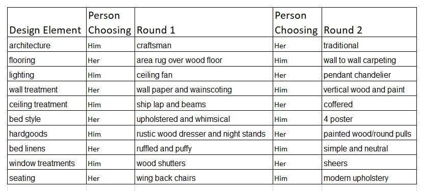 I then created a quick mood board showing the items chosen (round 1), then switched the assignments so that the items that He had initially been assigned became the items She needed to source and vice versa. I created a mood board for the reversed items as well (round 2). It is interesting how when the other person took on the different elements, their choices can shift the entire design style. Notice that HIs was very craftsman-like in the first mood board, but turned midcentury in the second. What is common in both His boards? Straight lines, wood details, and predominately neutral colors. The Hers elements remained more consistently romantic (maybe less Victorian and more traditional) across both boards with the curves and airy qualities of her choices. Both mood boards for both people show an interest in wood elements, some painted and some not. The challenge then is how to combine the elements to arrive at a room that both HIs and Hers will love! Sifting through the items and putting them together was even more interesting. The resulting style was not Craftsman or Victorian, but more of an island style with tradition, comfort, and romance taking the stage! 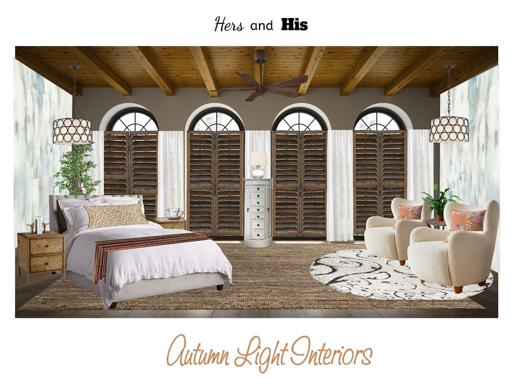 The case study I did had a happy and unexpected ending in the complete style shift even though I was playing both the his and hers parts. For your design journey, in the end you may not agree on anything. If you have the luxury of setting up one room that is just for you and one room that is just for your partner, that may be the compromise needed. When all else fails, hire a designer to work through it with you. Most are trained to find commonality in styles and design elements that when revealed will provide a direction that can develop into your personal, unique style. That is, after all, why you hire us...to create something that not everyone else has and that you can feel fully at home within.
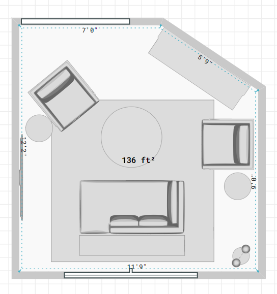
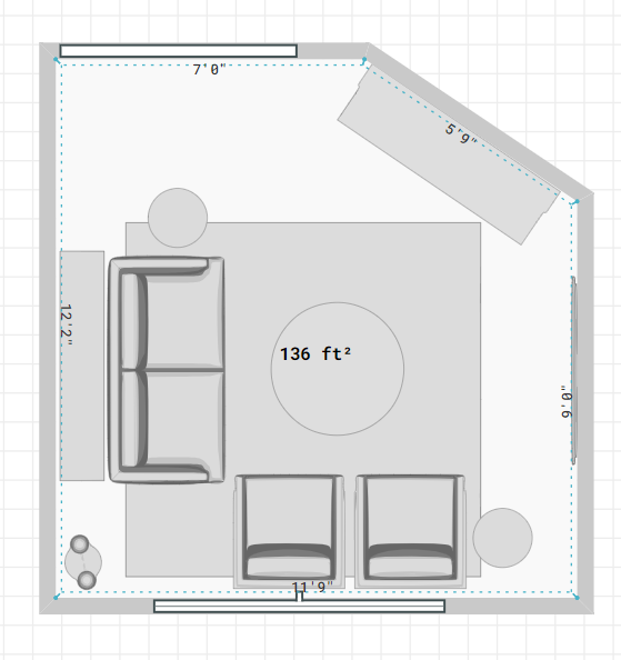
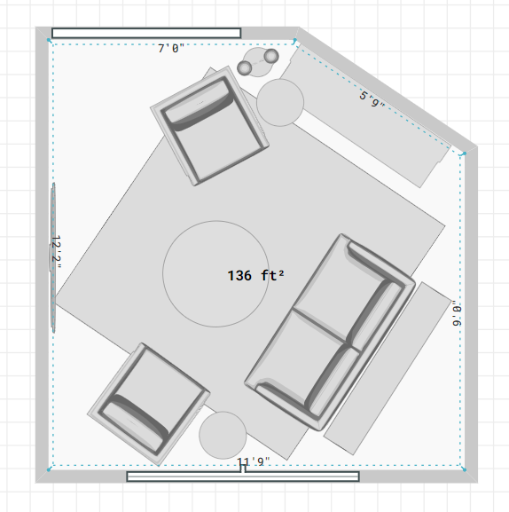
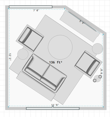
If you have a different style from your partner, let me know if you've figured out that common ground. Or not! There comes a time when you realize that the home you either just bought or have lived in and put up with for years isn't functioning for you. Aside from outdated appliances and finishes, the main complaint I hear from home owners is that they can't figure out where to place furniture. There can be many reasons for this, but these are some of the most common ones.
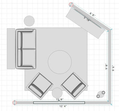
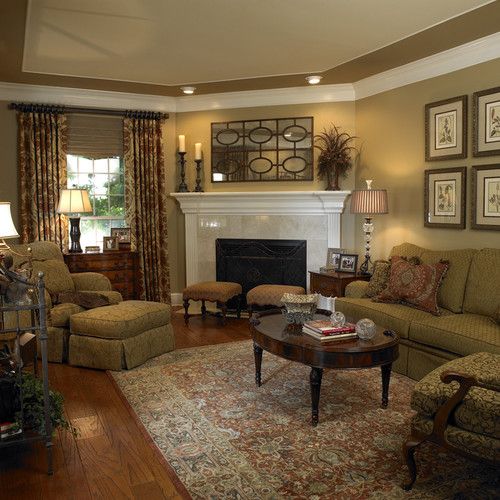
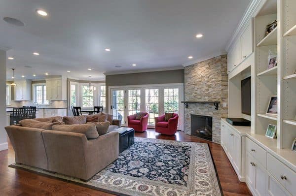
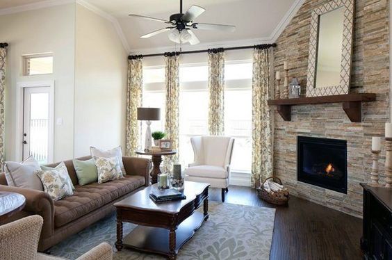
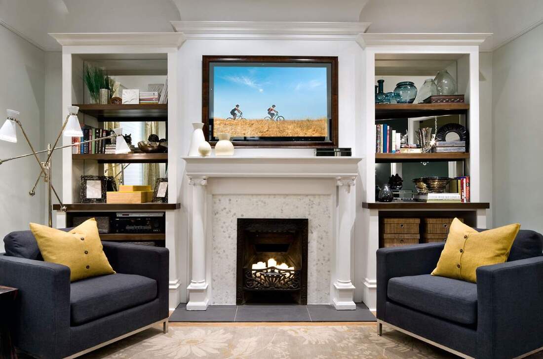
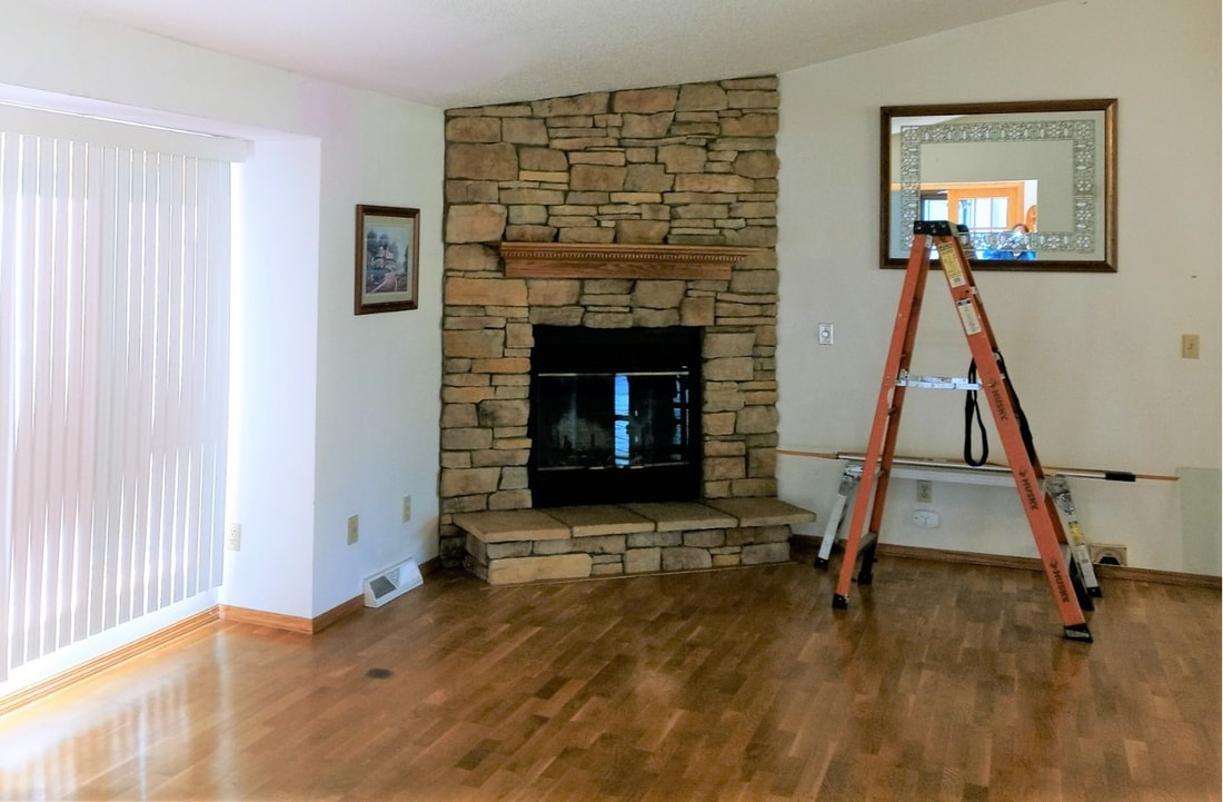 Everyone's home is unique, of course, so the following tips are general guidelines designed to help you think of solutions you may not have already thought of. I'll be focusing on living rooms to keep this blog post at a comfortable reading length! Drop a comment on this post if you have an awkward layout related to another room type. Many homes have fireplaces on an angle so let's use that as an example along with 2 other walls that have obstructions to placing furniture directly in front of them.
Tips for furniture arranging:
Placing furniture can be a challenge, but trying out different arrangements is the least expensive decorating you can do. Enlist some helpers so you don't hurt yourself in the process. Live with the new arrangement for a while before you give up on it. It may prove to be more functional than you think. Dawn Hearn Interior Design - picture on the left
https://nextluxury.com/home-design/best-corner-fireplace-designs/
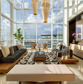
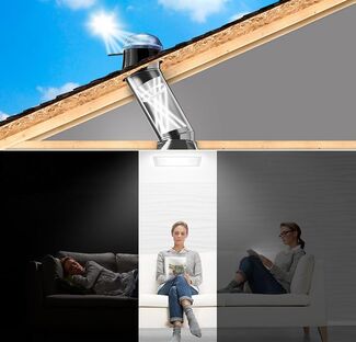
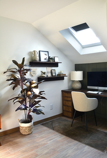
Skylights and solar tube lights briefly explained by the Market Watch Guides offer options to bring in more natural light when your current windows just aren't doing the job. These options are the most invasive and time consuming to implement, but provide the type of light we humans can benefit from the most - natural daylight - especially if you have north facing rooms or rooms without windows or windows that just don't provide enough natural light due to other obstructions. Energy.gov states: If you want to maximize daylighting and/or passive solar heating potential, consider a skylight's position. Skylights on roofs that face north provide fairly constant but cool illumination. Those on east-facing roofs provide maximum light and solar heat gain in the morning. West-facing skylights provide afternoon sunlight and heat gain. South-facing skylights provide the greatest potential for desirable winter passive solar heat gain than any other location, but often allow unwanted heat gain in the summer.
 But what about when the sun goes down or you live in a place where sunshine can't always be counted on? You may want to look at Reflective Lighting Strategies. Let's start with color. First of all, always test your paint colors on all walls before committing since color in a room is impacted as the angle of the sun changes throughout the day. It's likely not a surprise that white reflects the most light out of any color. Tinting a paint color means adding white to it. If you find a color you like but worry it is too dark, have your local paint store add white to tint it and test again.
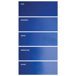
Consider the sheen of the paint to increase the reflection of light. Shinier/glossier sheens will make your paint color appear lighter. Take care to prepare the surfaces well for the shinier sheens as they will show more surface imperfections. Each paint manufacturer and each type of paint may have slightly different sheens but in general you will be using one of these shown here.. Another reflective lighting strategy is to limit textures (and clutter, of course). The more textures used in a space, the more shadows created. This brings us to using the right metals and mirrors to reflect light. Mirrors can be a BIG game changer. Placed in the back of shelves or opposite a window or on a table surface will bounce whatever lighting you have in the room around exponentially! Using the lighter metals - silver and gold rather than bronze or iron - will help bring sparkle as it is used throughout a space. We all have to add artificial light to manage lighting at night and for rooms deficient of natural light. Adding lighting in your home for all the tasks you do is important. Think levels and directions! Lights above or under cabinets illuminate downward, lights on tables or on walls can illuminate up or down, and lighting along baseboards or in-floor lighting brings light from below. And don't forget about the light span on your light sources. If you want a wash of light, a wider span is needed. If you just want to focus on a specific item or area, directional lighting allows you to highlight specific areas with a narrower light span. Last, but not least, know your light bulbs. An article by Frontpoint tells us what you want to look for to balance the amount of light with energy efficiency. "There are four different types of light bulbs available for residential use: incandescent, halogen, fluorescent, and LED. These varieties have different characteristics including the quality of light emitted, the amount of energy used, and more." Lumens and the Kelvin Color Temperature Scale are our friends. Watts, not so much! 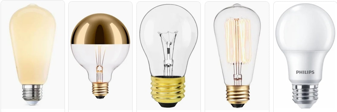 Once again Energy.gov helps us. "When you're shopping for light bulbs, think about the brightness you want by comparing lumens instead of watts. A lumen is a measure of the amount of brightness of a lightbulb -- the higher the number of lumens, the brighter the lightbulb." Just one of the examples they give is this:
 Kelvin Color Temperature Scale Overall, when it comes to color and light bulbs, take it step by step to see what feels right for your home and how you use the spaces. Let me know what you've done to improve the lighting in your home and how it affected you.
As promised in my last post of 2023, I'll bring you another design dilemma and tips to resolve it in my next post. One of my goals for 2024 is that I provide you a blog post every other month. I will focus on design dilemmas, among them perhaps awkward room layouts, outdated finishes, or bad lighting. Let me know in the comments if you have a particular design dilemma I could put into focus. I welcome a challenge! 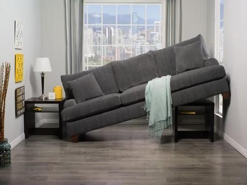 A real dilemma! In the meantime, here are a couple of items for you to ponder at the start of 2024

 With less than a week before Christmas, I'd like to wish all my readers a very Merry Christmas and a Happy New Year, too! The end of year activities don't typically allow us to rest, but I hope you find moments with family and friends to be uplifting and restorative. Enjoy the montage below of some of my favorite Christmas ornaments on our tree. From yours truly, Brenda Szarek 
I wish you all a very Happy Thanksgiving Day!

During this time of year there are many areas of the design industry predicting their picks for the up coming year. As I review the trends others are reporting, I've been putting together a list of my own. Some ideas match and others don't. The goal is the same - what can we do to make our homes beautiful, functional, and comfortable without looking like we all bought our furnishings and décor from the same store? I have 3 designs that I believe show the trends that will carry forward through 2024. They go from light, airy, and a bit nostalgic for an older elegant era, to natural and organic bringing nature and art together in a more modern style, and finally, to a moody mix of styles that makes you feel grown up and ready to relax and enjoy the home you worked hard to achieve. Romance and Glamour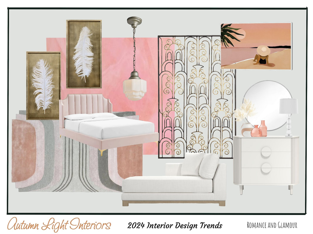 Pantone picked their 2024 color of the year to be Apricot Crush. The design I put together above uses the pinks and oranges of a setting sun as inspiration for an elegant boudoir! It is lighter and airier than Apricot Crush, to bring a softer side to a space where you'll want to wind down before you slip into your luxurious bed which envelops you with its padded wing back headboard. There are art deco accents on the dresser and screen along with the lighting and art bringing you to an era where you can dream big dreams well into the night. I picked these elements because we are moving into a time where everyone deserves a little romance to make them feel special and loved. The glamour factor just adds a cherry on top of a great big hug! Gather with Nature and Art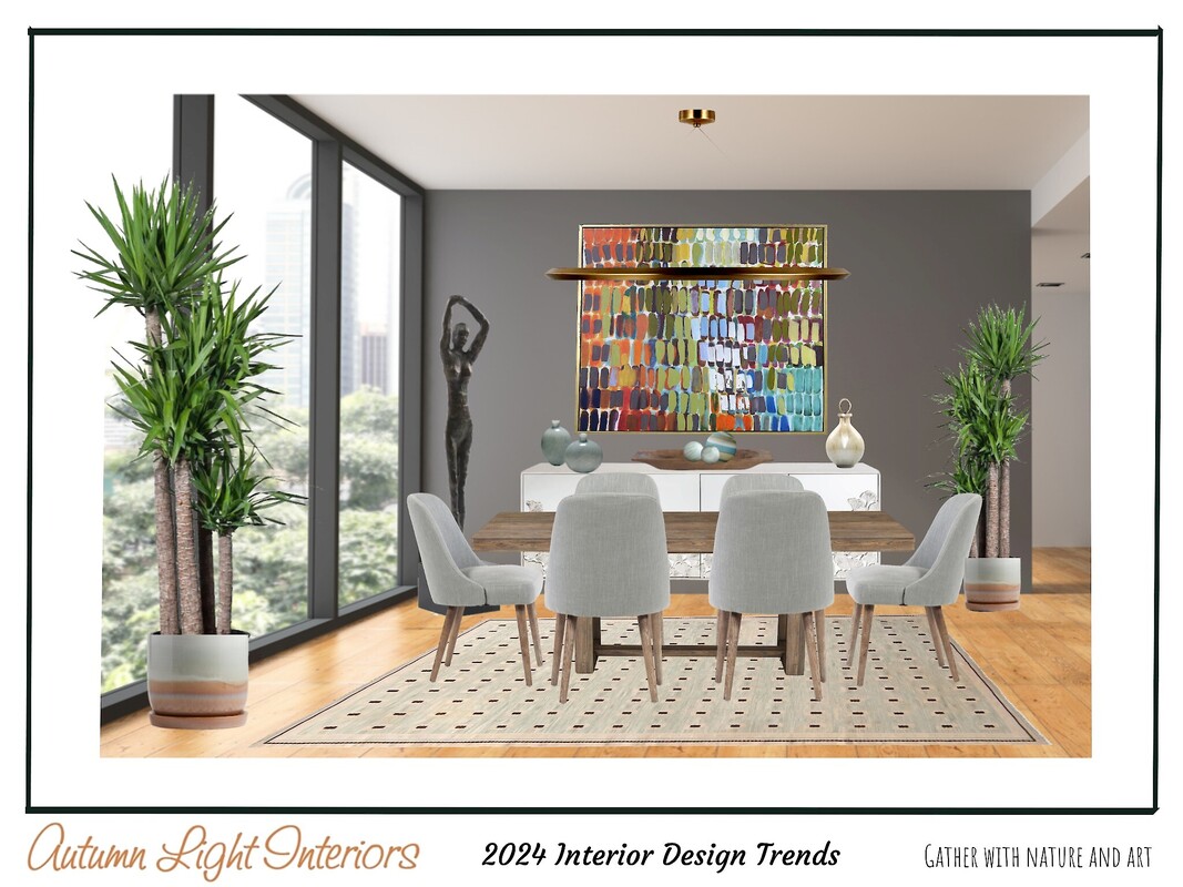 As we move from a good night's sleep to a place where friends and family gather, the design above moves out of the 1920's and 1930's influence to a much more modern approach that brings nature inside. Biophilic design has been around for some time, but gains momentum in 2024 as we continue to find more reasons and ways to entertain in and out of our homes. When inside, bringing nature together with artful moments helps generate conversation in a relacing atmosphere. Large tables and comfortable seating are a must. Sticking with neutrals for furnishings, wall color, and flooring make the art stand out. Statement lighting is an option to decorate that 5th wall in the room - the ceiling. Dramatic Quietude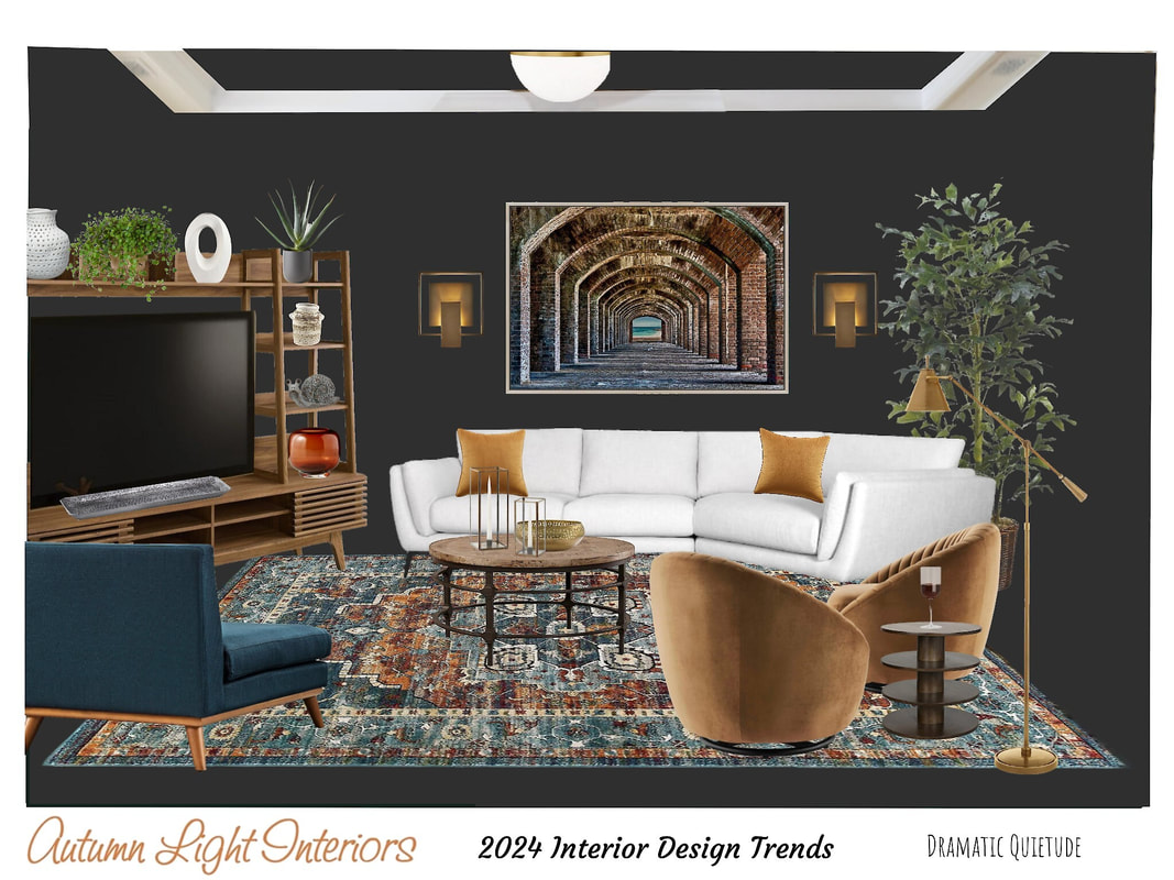 Drama and quiet? Why can't we have both! There seems to be many trend reports that show dark color palettes are still trending well in 2024. Sorry Pantone! The design above is a moody mix of mid-century, industrial, and Asian influences. Painting a room dark, whether large or small, does not necessarily close you in. Think of standing in a large field surrounded by a vast dark sky. Imagine the immenseness! As long as you add in great lighting and light colors around the space, you will just feel the drama of a great night ahead.
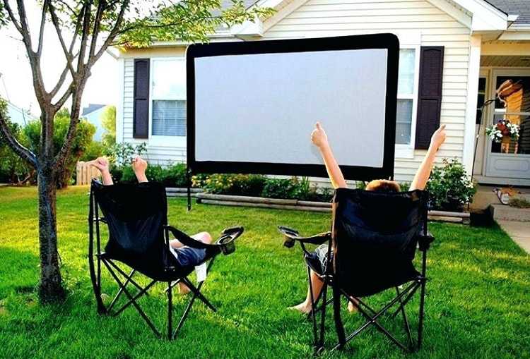
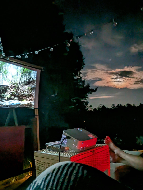
Watching movies outside is such a relaxing, fun way to spend time with friends and family or a romantic partner! I'm working on setting up my own outdoor theater and in doing so found this brief article with great information for all aspects of the setup. There are so many ways to set up seating for your theater no matter what movie genres you are interested in. The main goal to keep in mind, of course, is comfort. 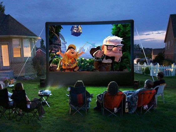 Pixar's movie "UP" 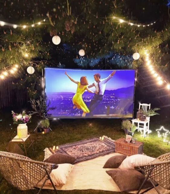 The movie "La La Land"
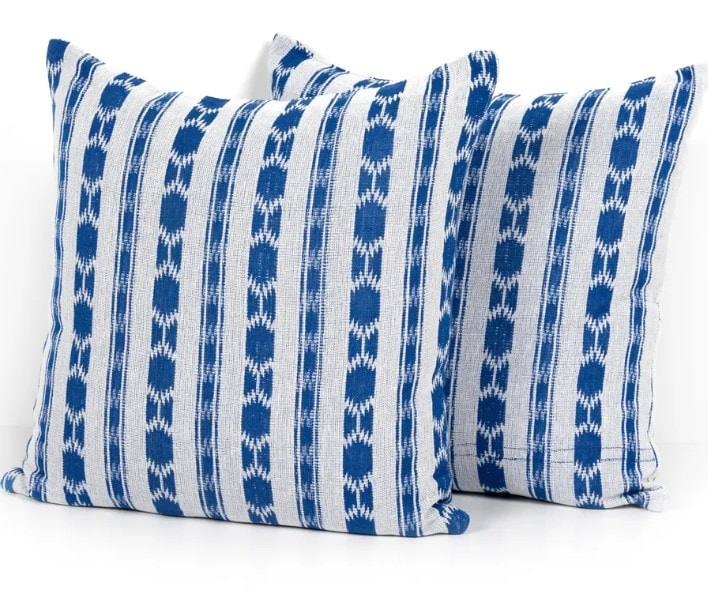
This set will get you chillaxing in no time! The gray and blue scheme brings on images of sitting by a body of water on a warm summer day. Your checkout link: Click here.
Next is a set that is very close to what I purchased for the deck at our cottage. I can't wait to get my theater set up so I can curl up and enjoy the outdoors and movies with my favorite guy - my hubby, of course! Your checkout link: Click here.
Finally, this set made from teak wood has some pillow options that would go well with any of these items in the links above. Teak is great for outdoor furnishings because it is one of the strongest and most durable hardwoods. It performs well when exposed to weather conditions such as rain and sun. Your checkout link: Click here. 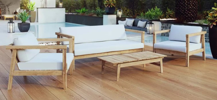 Don't forget to add a coupon code at checkout to get 7.4% off in honor of the 4th of July holiday. Enter this code without the quotes: '4th-of-july-special'. 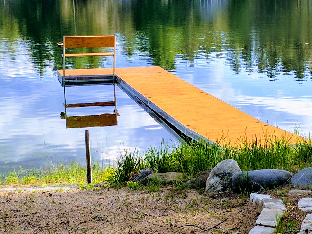 Have a wonderful summer!
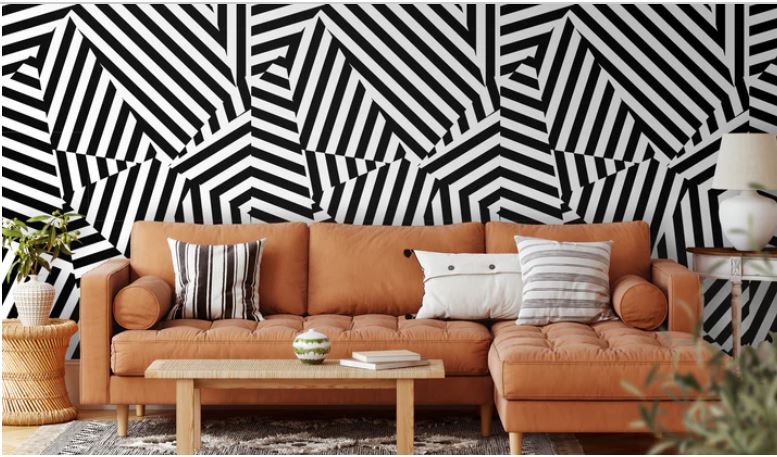
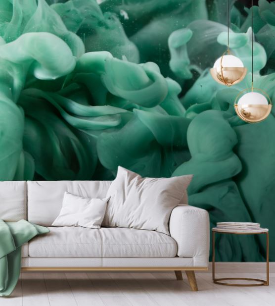
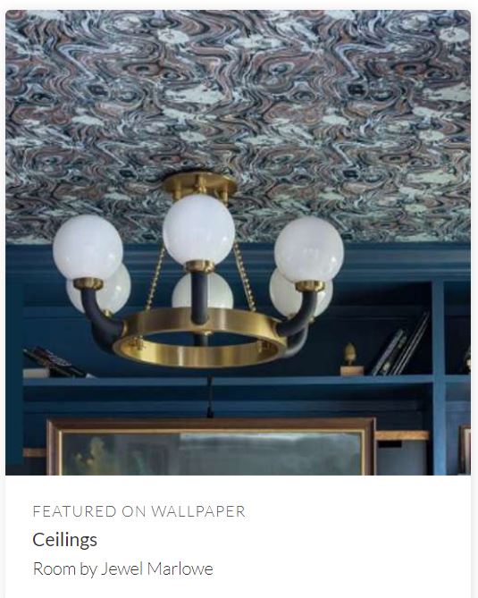
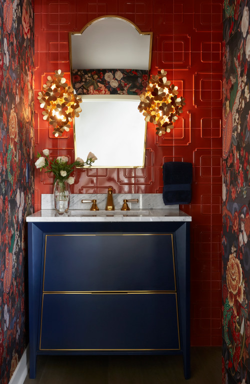
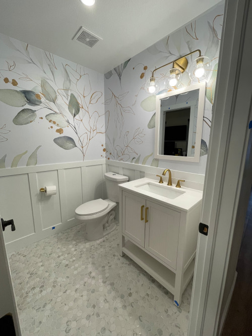
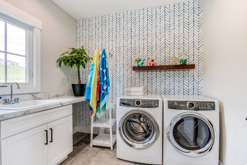
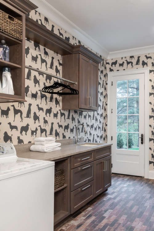
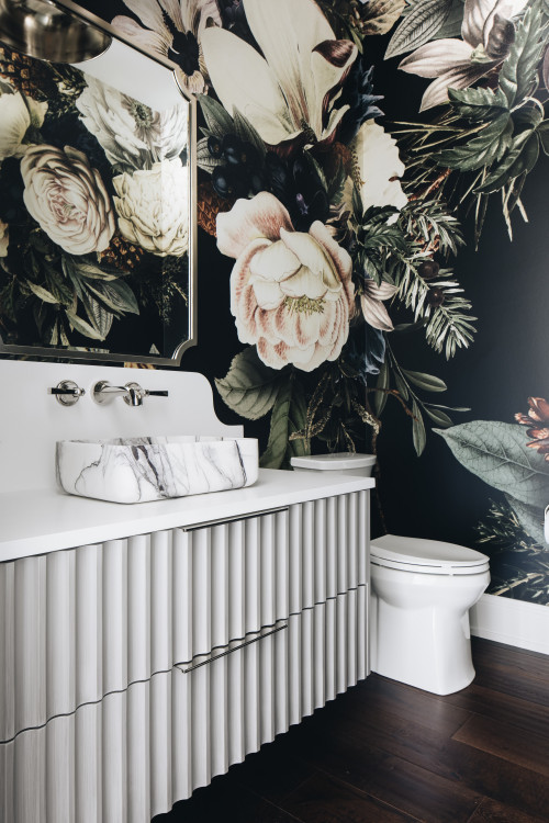
Sure, you can paint your walls with some great color, add an Ombre affect or tape off a cool geometric design. But how do you get a really great impactful design on your walls or your ceiling? Try wallpaper or a wallpaper mural!
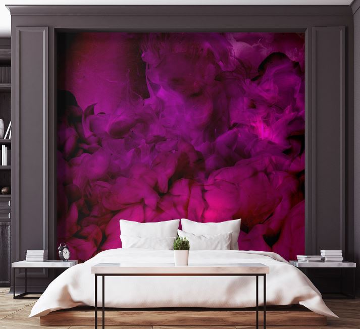
Offering options with an attitude! Black Crow Studios located in Long Beach, CA, has a gorgeous selection of custom murals and wall paper printed on smooth matte wall covering material that is PVC-free. It is definitely not your grandmother's (or even your mother's) wallpaper. Each design has movement and color that will transform your space and set the mood for the rest of your home or give a single space the voice it needs to make it special and appreciated. Here is an article by Ginna Christensen highlighting their Rebel with a Cause campaign.
https://www.blackcrowstudios.com/ All from Black Crow Studios
|


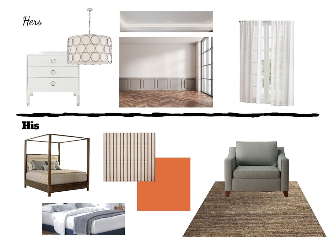
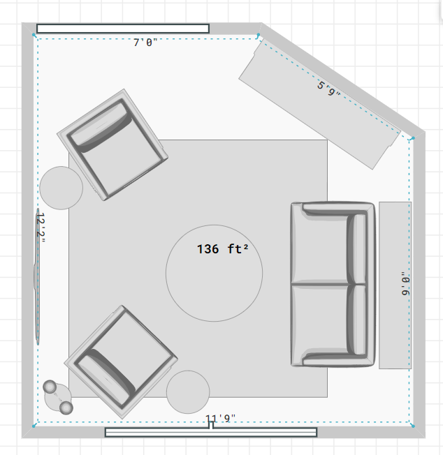

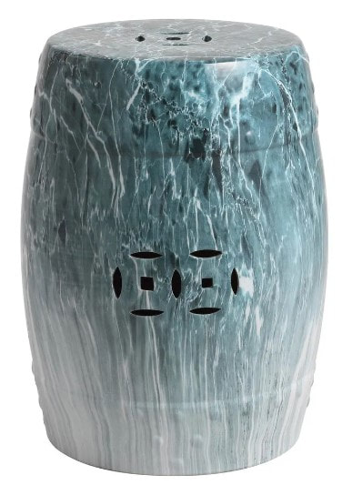
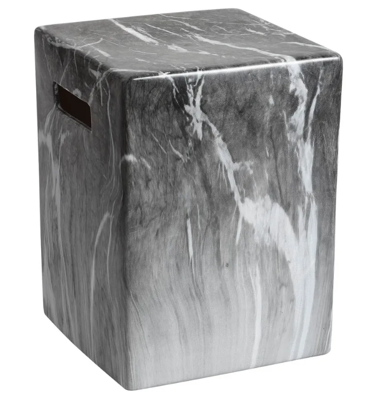
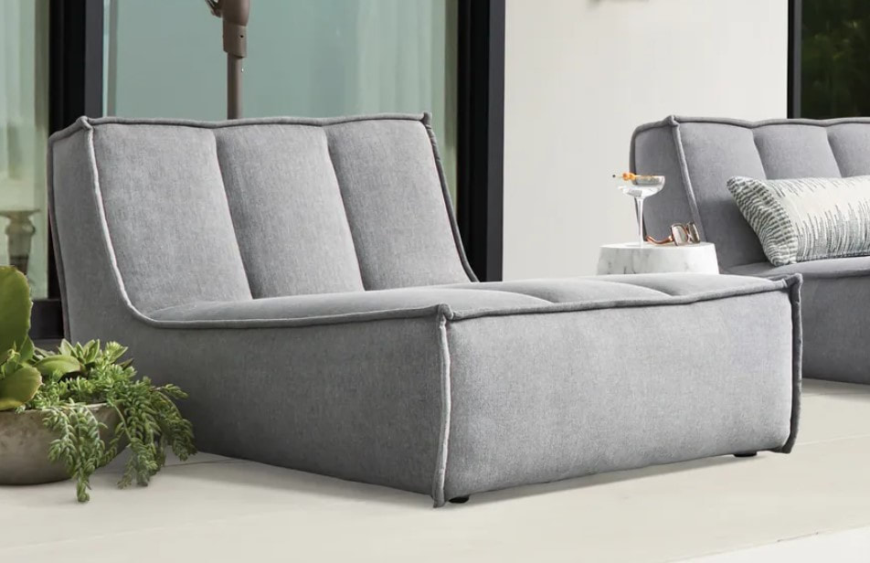

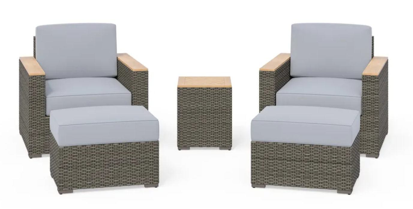


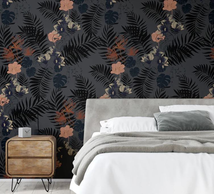
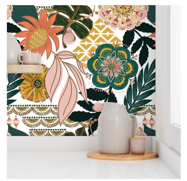
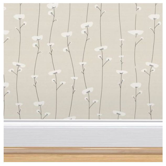
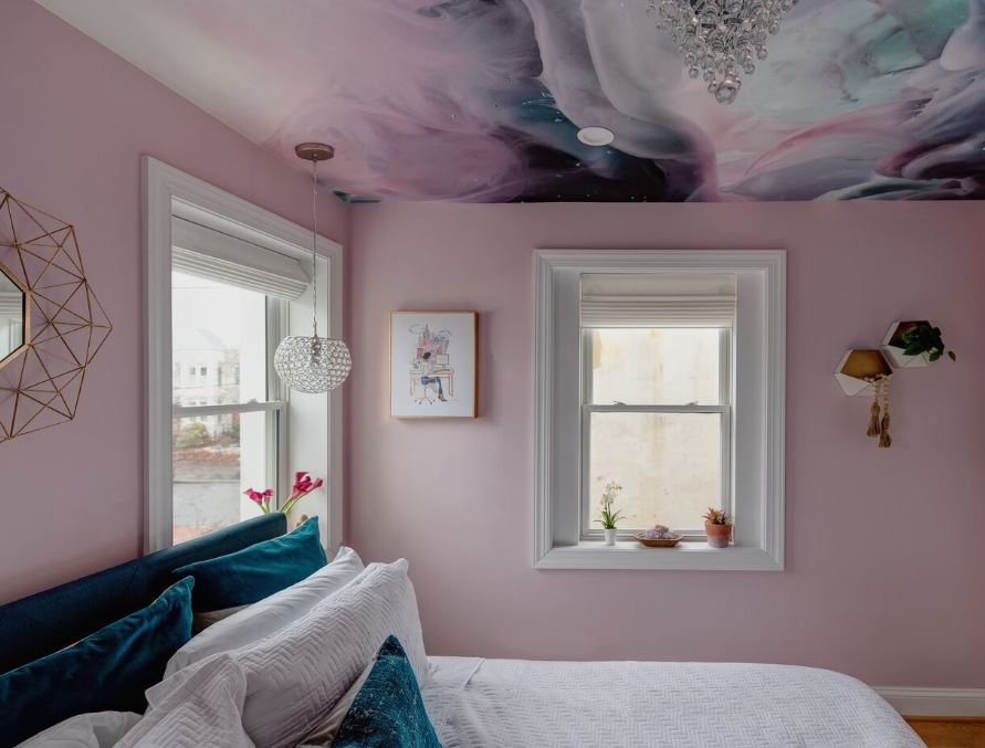
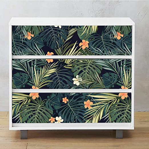
Amazon Removable Furniture Stickers
|
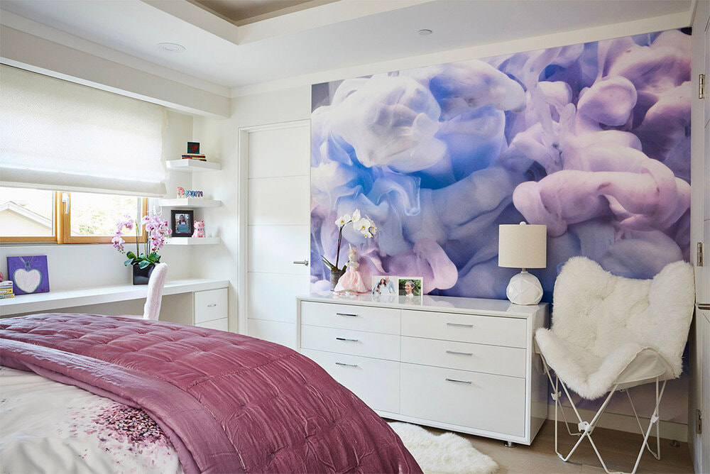
Black Crow Studios
|
But first, here is a look at the last 2 years...
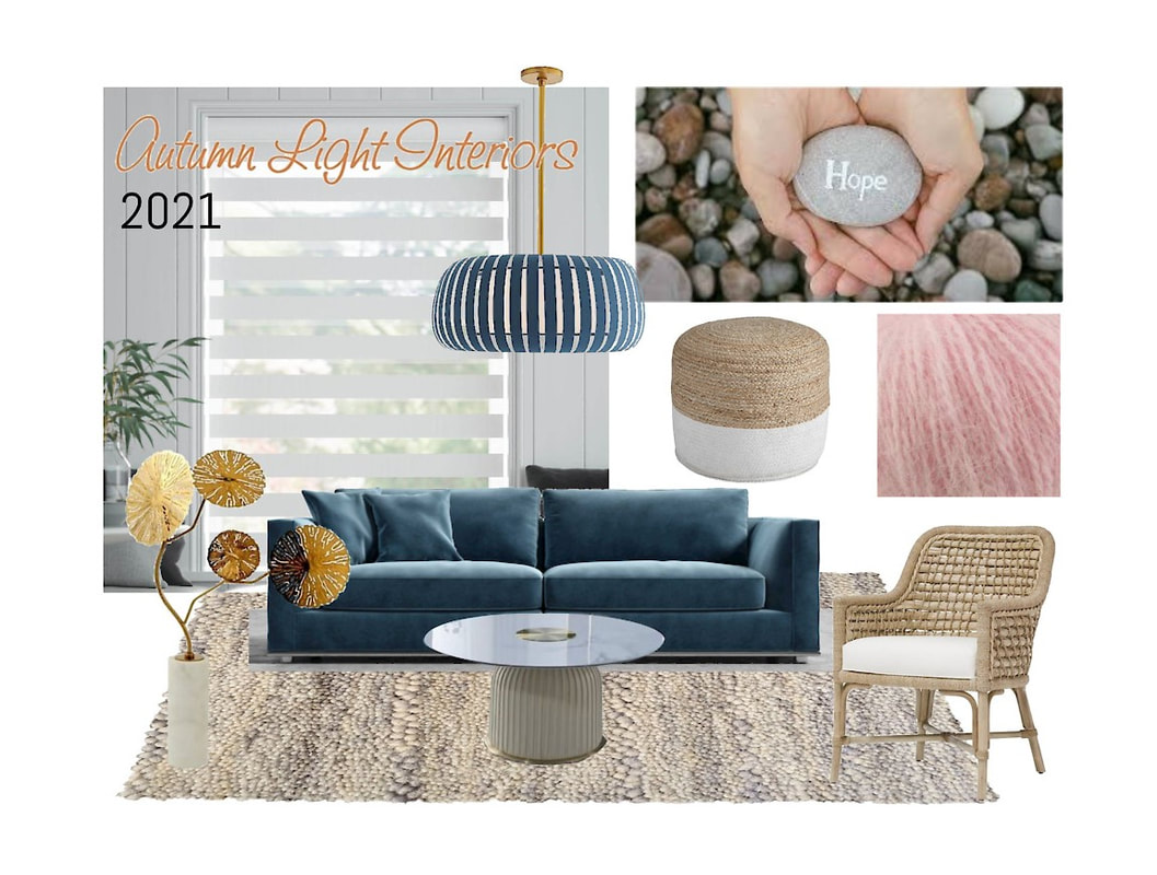
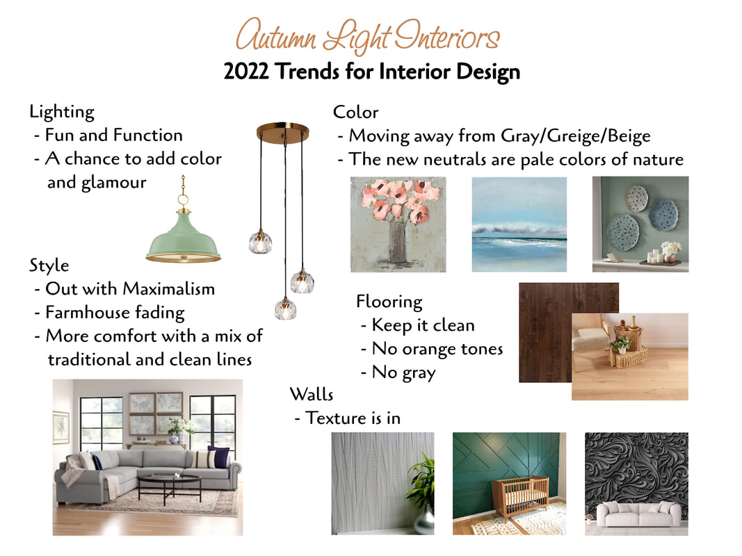
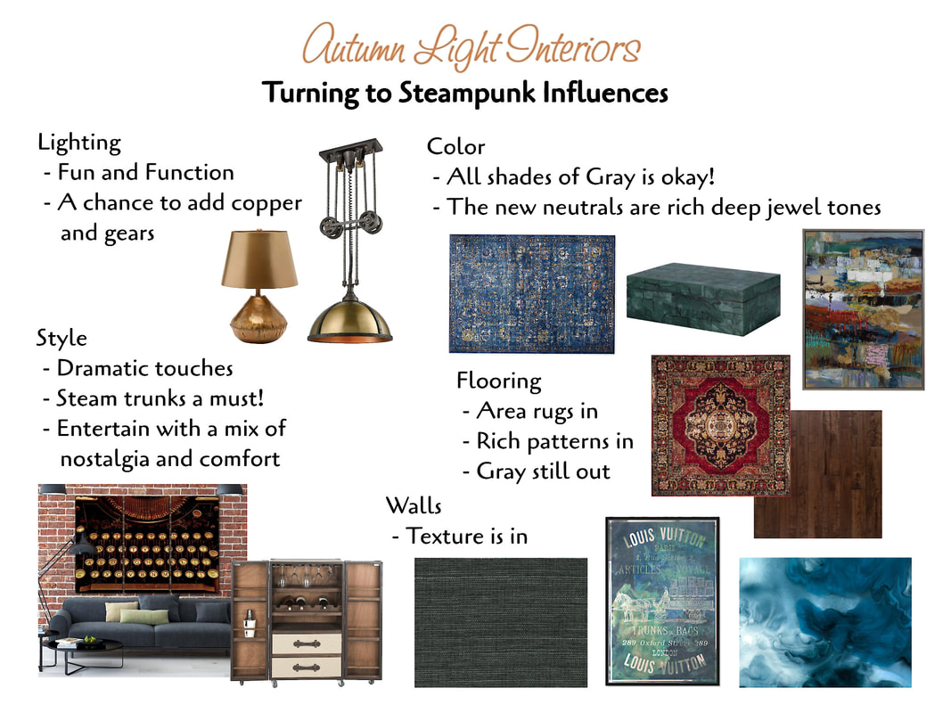
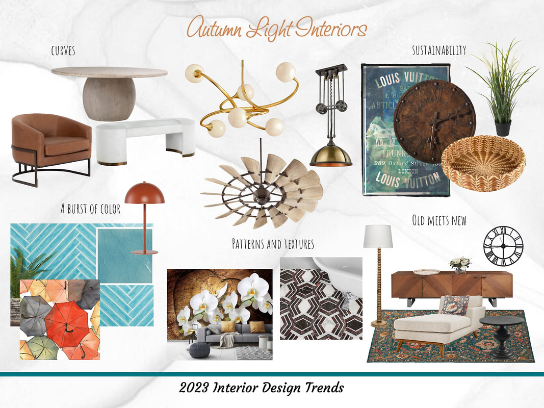
Curves - Not just for the voluptuous! Furniture, lighting, and accessories will boast large round contours that either envelope you in a comfortable bubble or send you figuratively in a spin.
Sustainability - We need to focus on our world and find ways to retain resources. Reusing materials, upcycling, repurposing, mindful and responsible manufacturing, and even using nature only when it is abundant. (I've been looking for ways to reuse all those pine needles at our cottage, but I'll leave making artful bowls like the one pictured to the experts!)
Old Meets New - What better way to reuse/recycle/repurpose then to bring in a few old, well loved pieces along with the newer items. You'll get a much better livable look that won't go out of style so quickly. On top of helping the world, you are building your own personal style. Who else has Grama's old side table and Uncle Fred's Mid-Century media cabinet?
Patterns and Textures - I've heard it said that Maximalism is trending. I don't think that applies, or should apply, to everyone. Adding pattern and texture, however, should. Without pattern and texture, your rooms will look flat and untouchable. Patterns can be found in fabrics, tile placement, murals, and more. The same can be said of textures. Have fun, remember to repeat 1 or 2 times throughout the room, but know when to stop. It can be tricky to pull off a highly patterned theme without adding chaos and stress, but you can have fun experimenting.
A Burst of Color - Let's not forget color! Be bold. Use what you like. If it turns out you picked an overpowering color you can't handle, either repaint or add loads of white in other elements to lighten it up. Try to stick to 2-3 main colors in any one space adding neutrals, woods, and metals to bring it all together. If one room has a burst of a certain color in a large area, try using the same color or shades of it in an adjoining room on smaller pieces. Remember that lighting will play a major role in how your colors work, so ask an expert (me!) if you need some assistance.

Meet Your Designer
I, Brenda Szarek, am the founder of Autumn Light Interiors. I have immersed myself in home design and problem solving for years and have creative solutions for all kinds of interior design dilemmas. I hope you enjoy my tips, tricks, trends, and inspiration to help you find your way to a well-designed, comfortable, and functional home you can be excited to live in and welcome others within.
Archives
July 2024
May 2024
March 2024
January 2024
December 2023
November 2023
September 2023
June 2023
February 2023
December 2022
November 2022
July 2022
June 2022
May 2022
April 2022
March 2022
February 2022
January 2022
December 2021
October 2021
August 2021
July 2021
June 2021
May 2021
April 2021
March 2021
February 2021
December 2020
November 2020
October 2020
September 2020
August 2020
July 2020
June 2020
May 2020
April 2020
March 2020
 RSS Feed