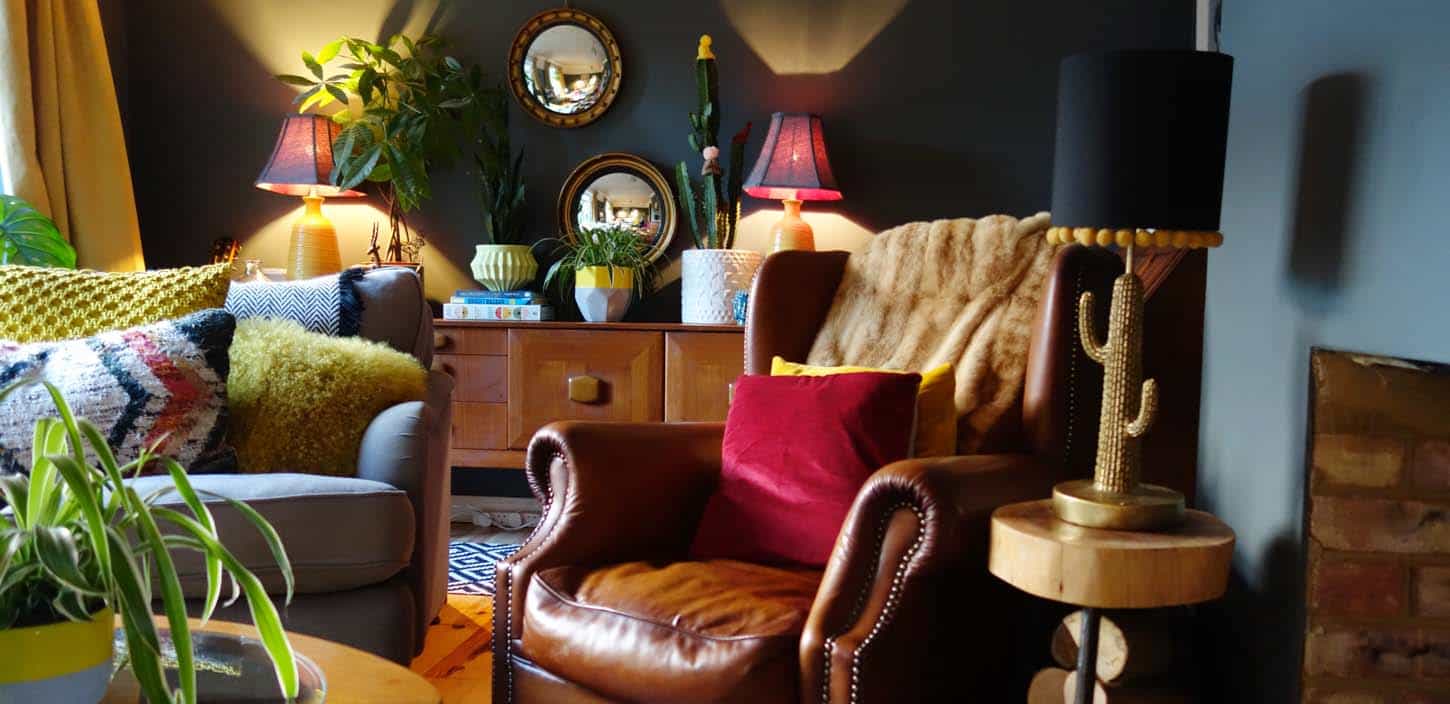
 Texture is key to creating a rustic look. Use natural textures of varying woods to make the room warm and inviting. Large scale art and bold colors add a modern touch. Soft fabrics on the upholstery and the faux fur throw bring a bit of luxe playing nicely with the underlying rustic mood of the space.. What a great place to read a book or have a conversation!
0 Comments
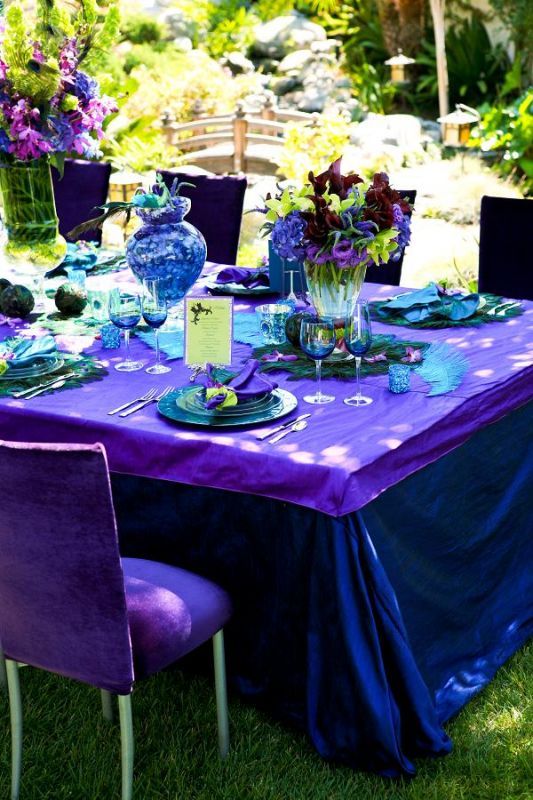
 PHOTOGRAPH BY RICH REID I've been exploring the meaning of color for interior design by giving you small snippets of decor in separate blog posts for each color of the rainbow since February 2021. I've gone through Red, Orange, Yellow, Green, and Blue. Today, let's explore the last two colors which often get confused - Indigo and Violet. Some of the confusion between the colors is explained with a quote from this article BY OBINNA APRIL 9, 2021: "The color indigo and violet are very close to each other and it is easy to mistake one for the other. This arises from the fact that in the ROYGBIV color arrangement, they follow each other after blue. In fact, the deep color indigo that a computer screen can produce, is also called blue violet. Both colors appear to be inseparable and there are hues of indigo that are closer to violet than they are to indigo. Additionally, the imperial blue color is regarded as indigo as well. Indigo really threads a thin line of existence that has led many in past to call for it to be erased and just be left with blue violet color." What do these colors mean for our interiors?Impressive Interior Design states "...indigo color speaks to inward examination and self-reflection. It is shading for calm consideration." InteriorDezine gives us a large list of adjectives for violet/purple: "Well Balanced, Restful, Promotes Peace And Calm, Serene, Regal, Dignified, Elegance, Day Dreaming, Spiritual, Royalty, Supremacy, Quietness, Reverence, Lowers Blood Pressure, Quietens Overactive Glands And Organs, Internal Dialogue, Philosophical, Lateral Thinking, Creativity." Here is my inspiration mood board showing a blend of indigo and violet with furnishings and art that can make your home beautiful, restful, serene...oh so many good things! 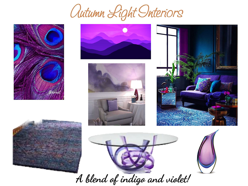 Deadline for offer sent to newsletter recipients is 9/30/2021.
Are you thinking of moving in the next 5 years? Does your home need a long awaited upgrade to appeal to today's buyers? Why wait! Start the process now so you can enjoy it before you sell.  Start by assessing where your home needs the most help. Curb appeal should be your primary focus along with decluttering no matter how much money you have to invest into transitioning your home to be sold. Assuming you are not planning to move for a few years, here are some ideas to set you in motion on the interior depending on your budget: Minimal funds
Enough funds for a simple refresh
A stash of funds for a serious upgrade can be available if you dip into your home's equity or you've been saving for an upgrade for some time
Here is where an interior designer can help
 There is no more of a serene, calming color than blue in my opinion. Okay, maybe green, but I'm talking about blue today! This color is so easy to work with as an accent, in a monochromatic scheme, or as a statement color throughout your home. From the lightest of blues to shades of gray blue to the darkest of blues, there is a shade or tint that conveys every mood. There are products in every form that will help you pull blue into your interiors (and exteriors). Fabric, wall coverings, appliances, cabinetry, cookware, furnishings, lighting, art, ...you name it! In the last 2 years, blue has been the basis for the color of the year as named by a few top color organizations in one shade or another.  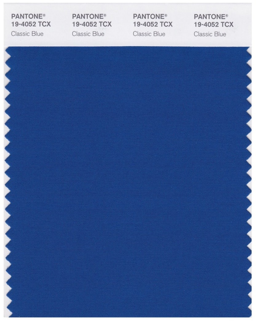 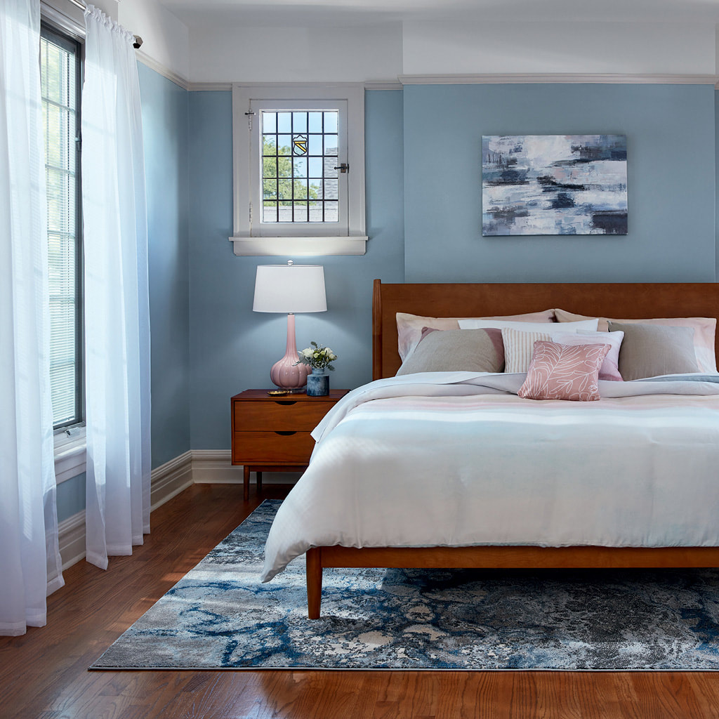 Norwegian Night by Valspar - 2021 If you haven't been convinced this color is soothing, click on this link to be mesmerized by Valspar's interpretation of the sound of blue - CLICK HERE.
I've reached the middle of R.O.Y. G. B.I.V in my exploration of color - Green. It's summer here in Wisconsin. The heat is on and the grass and trees are displaying all shades of green. The American Psychological Association says green is good for us. This is true in more ways than one. The color green gives us the feeling of tranquility with its association to nature and with the ease our eyes have in viewing it as they don't have to adjust to the wavelength of cool colors as they do for warm colors. Going green is also a way of helping our environment, living sustainably, and being ecologically responsible. All good, right? Let's SHOP! Click on the image to go to my shop collections. Contact me for deep discounts if any item appeals to you. When you meet your designer at the start of a project, so many questions are asked to get an idea for the look and feel you want for your room. Water, landscapes, food, metal and other materials we see evoke a certain feeling. Creamy ice cream, fun confetti, rich landscapes, lazy rivers, rusty pipes... Just adding the adjectives starts the story that can lead to the look and feel you might want your room to have once it is transformed from inspiration to a finished space. Here are a few examples of rooms that reflect the inspirational items shown in the mood boards I developed. Party in Pink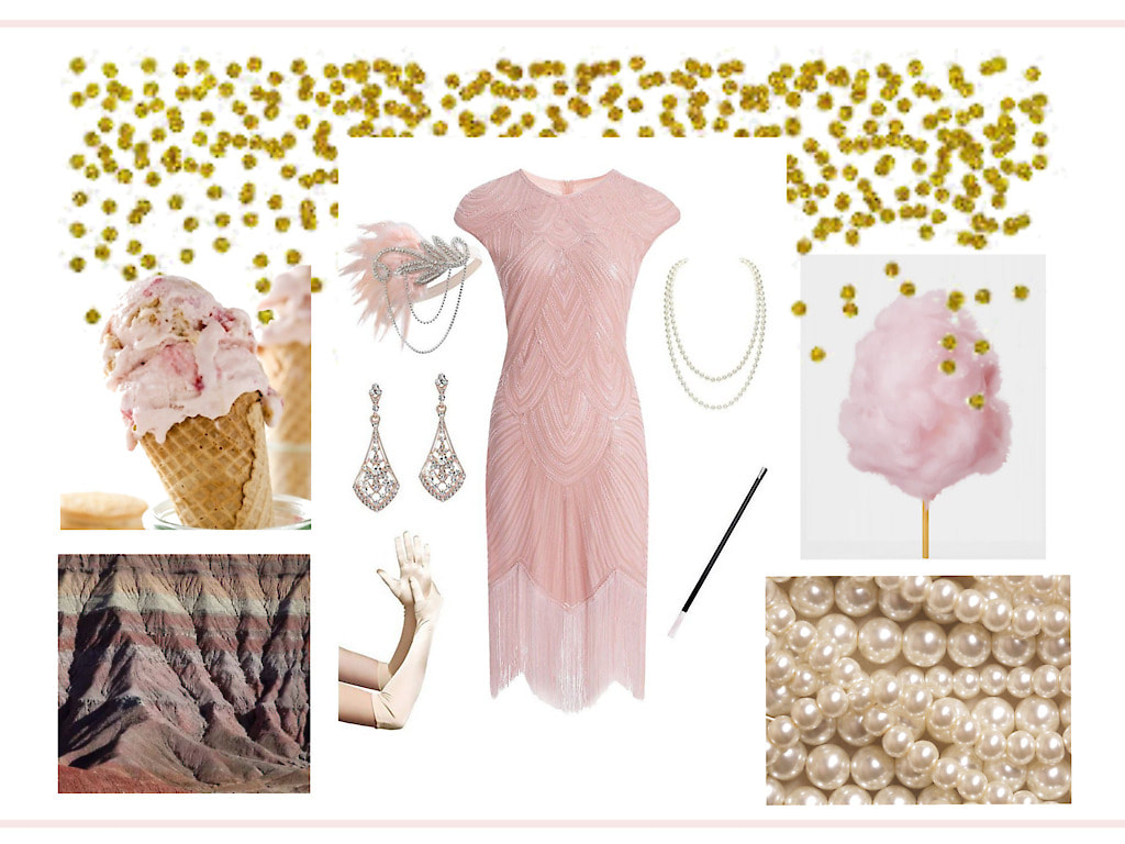 The roaring 20 attire, confetti, ice cream, and cotton candy all say LET'S PARTY! When we ground it in the beauty that nature brings with the mountain side and the pearls from the sea, we get a room that is ready for entertaining as well as relaxation. 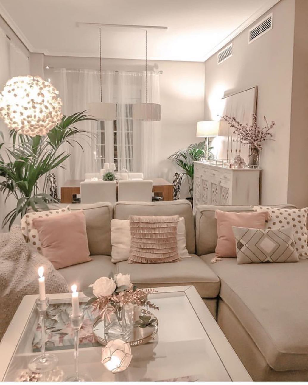 Grounded in the Sky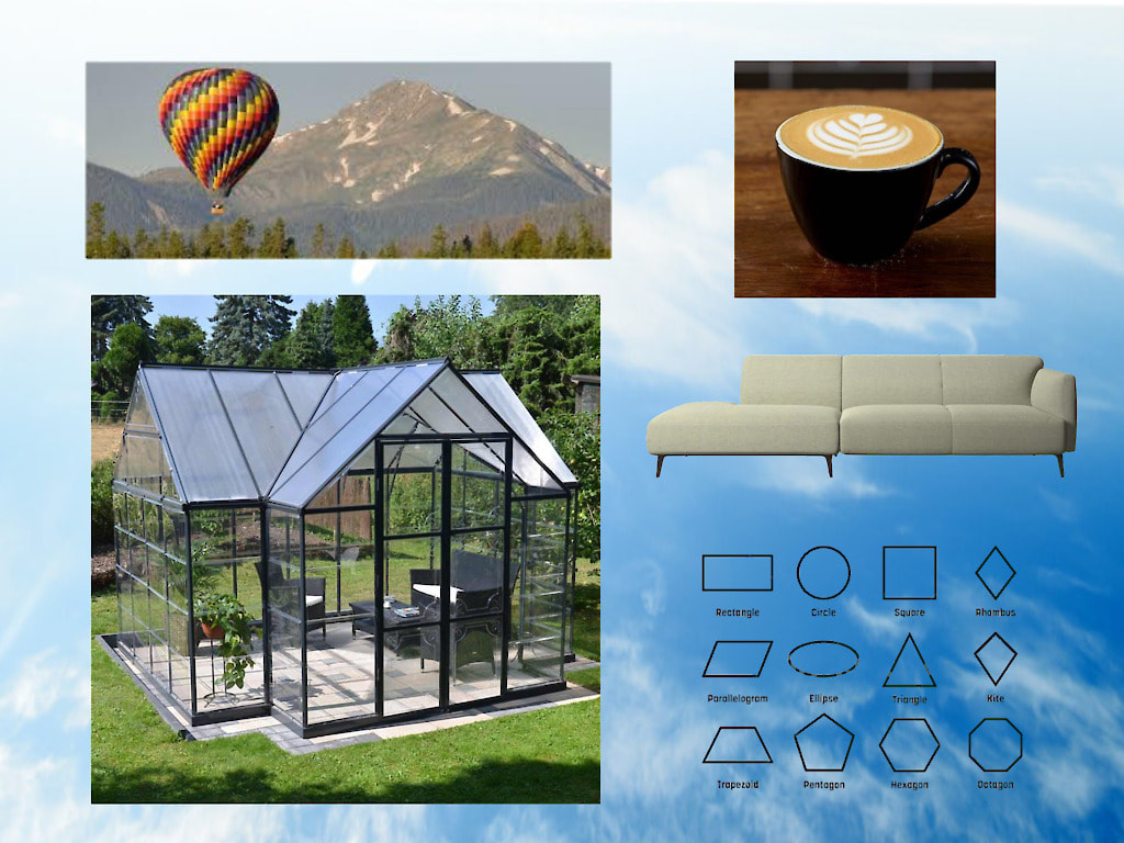 Who wouldn't want to soar in the open airy space of the sky, then come down to earth for a warm latte in a comfortable modern room. The geometric patterns of the area rug and the low furnishings ground the room. The hot air balloon inspired lighting brings your eyes up providing continuous visual flow. 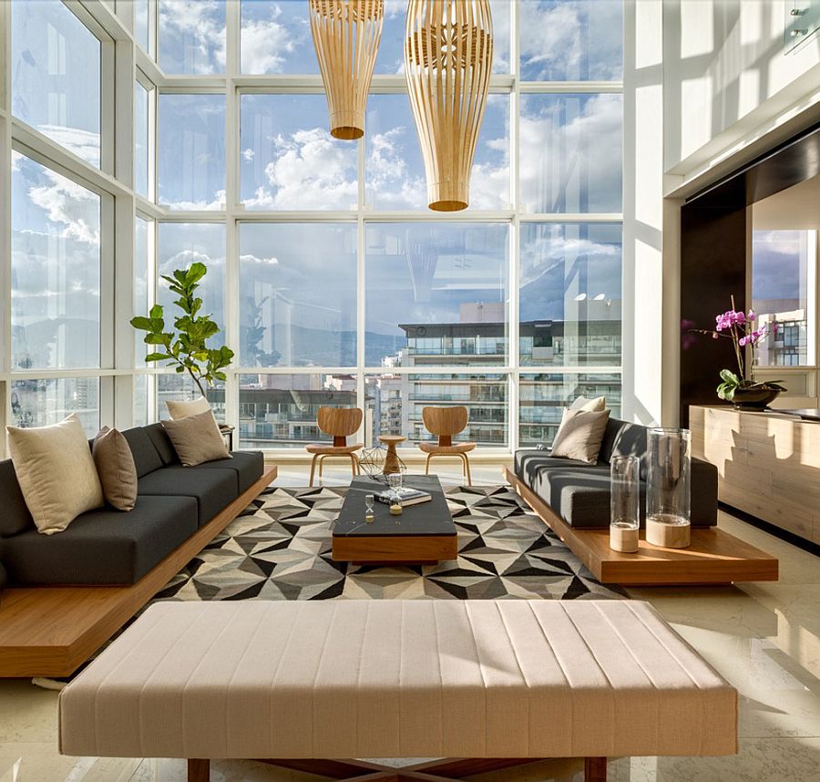 Havana Elegance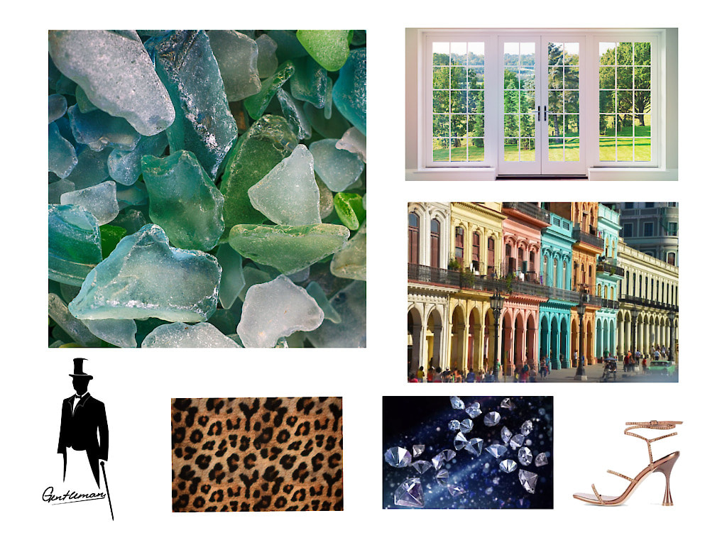 This mood board brings spice and elegance paired with color and texture that say nothing less than "Let's spend the day in the sun, then join me for a romantic night under the stars". There is formality in the furnishings combined with whimsical art and animal print and tropical inspired toss pillows. The jewel toned wall color and furnishings coordinate with the sparkling chandelier and gold on the tables and credenza. 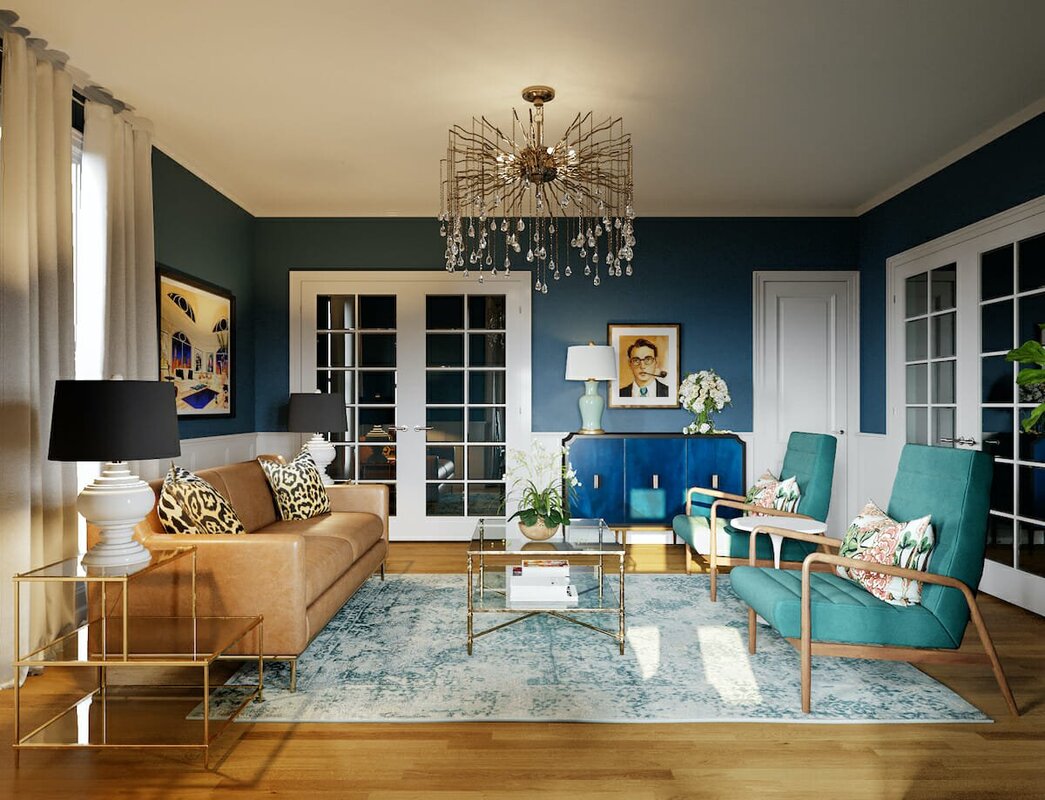 I hope you enjoyed the inspirations for these rooms. What inspires your decor? Let me know if you need help translating your inspiration into the room of your dreams.
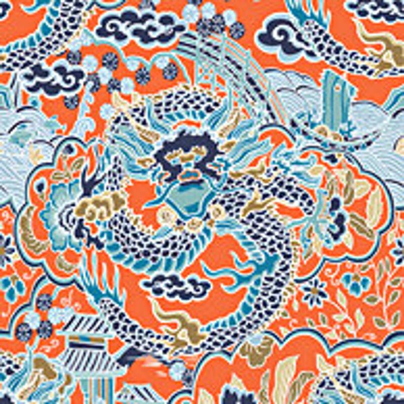
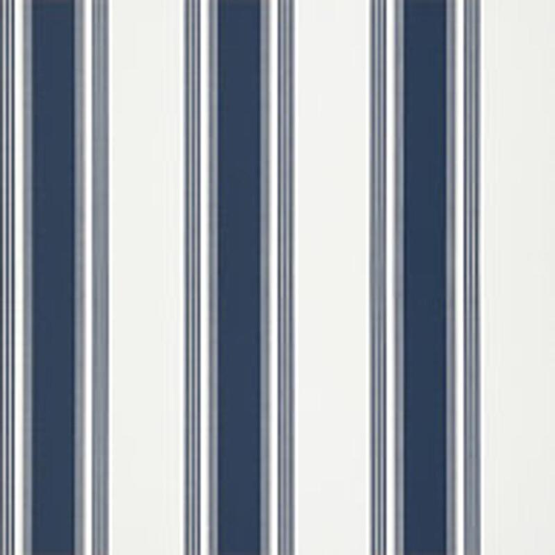
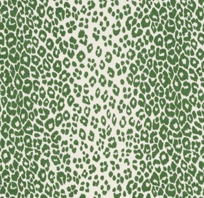
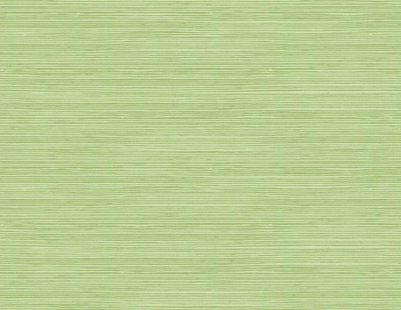
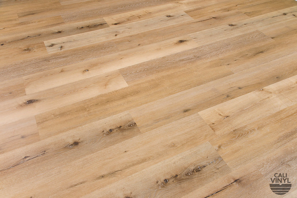
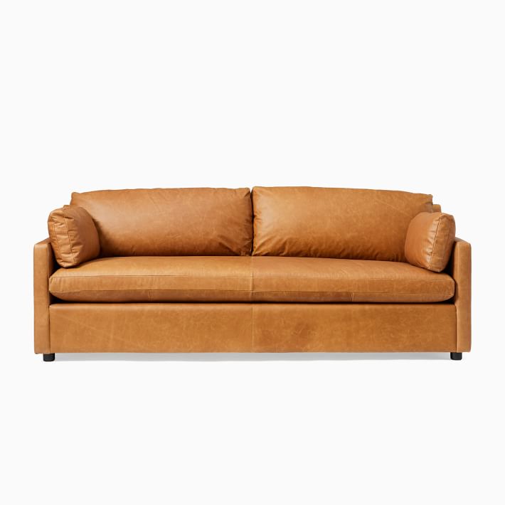
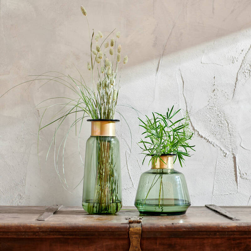
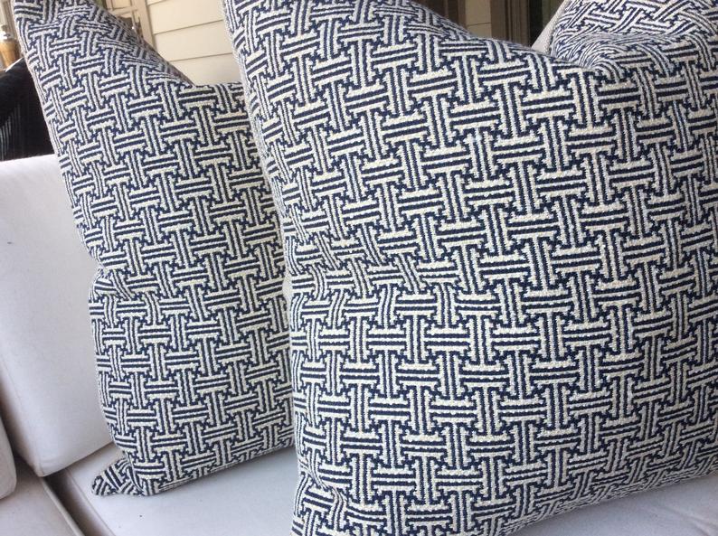
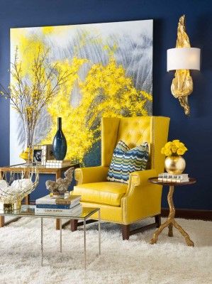
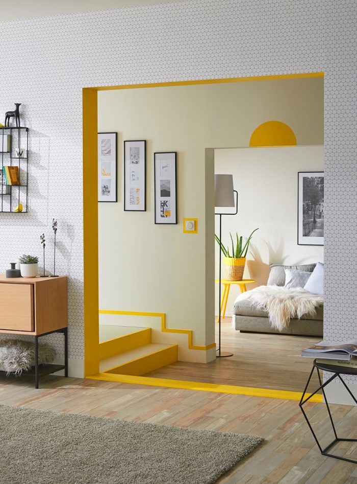
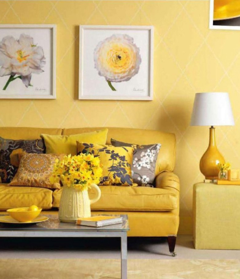
Adding patterns to your home decor can bring a room from bland and boring to the next level. What is the next level for you? That will depend on your style and the feelings you want your room to evoke. (For a quick review on Style vs Feel, see this older post on my blog - Click here.) Patterns add visual texture, sometimes with true texture and most often with a flat image in two or more colors. The pattern can come in the form of fabric, paper, wood, and all kinds of other media you find in furnishings, art, window coverings, flooring, etc. One option to tie patterns together is to choose a common color from within a multi-color pattern. For example, by starting out with this multi-color image from Designer Thibaut Imperial Dragon Wallpaper, I chose to pull out the blue in the wallpaper and pulled together a small scale print and a large scale stripe to complement the busy Imperial Dragon design. Changing the scale is key to achieving pattern balance. Another option that can give a calming effect is to use patterns with the same color scheme and keep the scale small so that nothing pops out at you on its own. Often times you will find you need to work with a pattern that is difficult or cost prohibitive to remove, such as existing flooring. Using different textures will add visual pattern. This rustic flooring is complemented with a similarly rustic wall treatment shown with the brass banded glass vases which adds a smoothness balancing the look. Toss in a textured throw and pillows to provide inviting comfort with a nod to the original rustic look. The smoothness of a brushed leather sofa transitions rustic to elegance. I love this look. Don't you? It is important to have a focal point in a room, but you also want the rest of your space to appear interesting and inviting. Repeating patterns around a room will keep your eye moving around the space.  There are several repeated patterns in this space. The curvature of the sofa is repeated in the coffee and dining tables, the rug, and the lighting. There are short lines repeated in the wallpaper, pillows, and drapery, as well as long flowing lines repeated in the wood flooring, the verticality of the drapery, and the dining area rug. Stripes and colors are repeated in this playful living room. 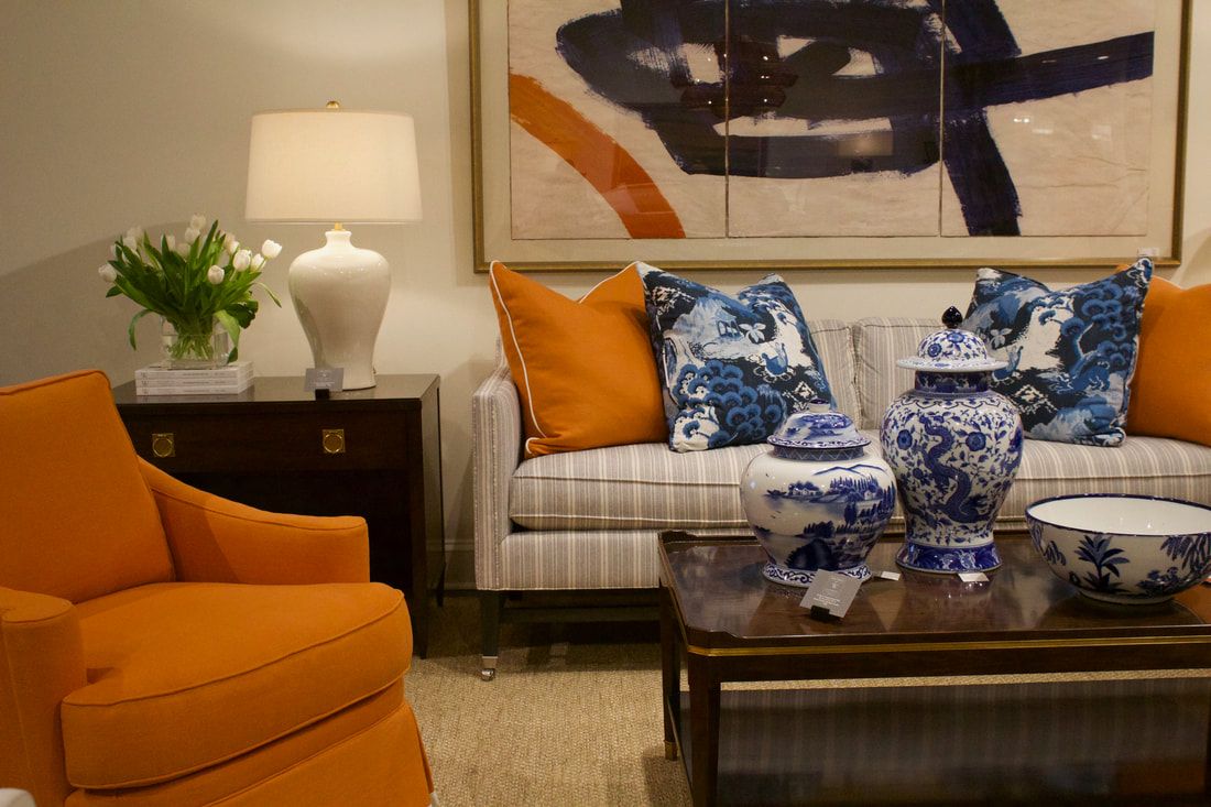 This is a great example of mixing traditional elegance with modern art. The fabrics vary from solids and stripes to organic blue and white imagery. The jars and bowl repeat the organic imagery and the jar shape is repeated in the lamp. The smooth surfaces of the tables add tactile appeal. The crisp lines of the piping on the upholstery complement the lines in the artwork above the sofa and the striped material in the sofa. It all works! Yellow is a color that provokes conversation, invites you into a space with positivity, and brightens the day! Used as an accent brings light. Spread in small amounts in an otherwise moody space brings balance. Paired with deep tones of blue, green, or black and white adds drama. Finally, an explosion of yellow in monochromatic shades warms the space. #autumnlightinteriors #colorstudy #yellowdecor See Red and Orange at these links:
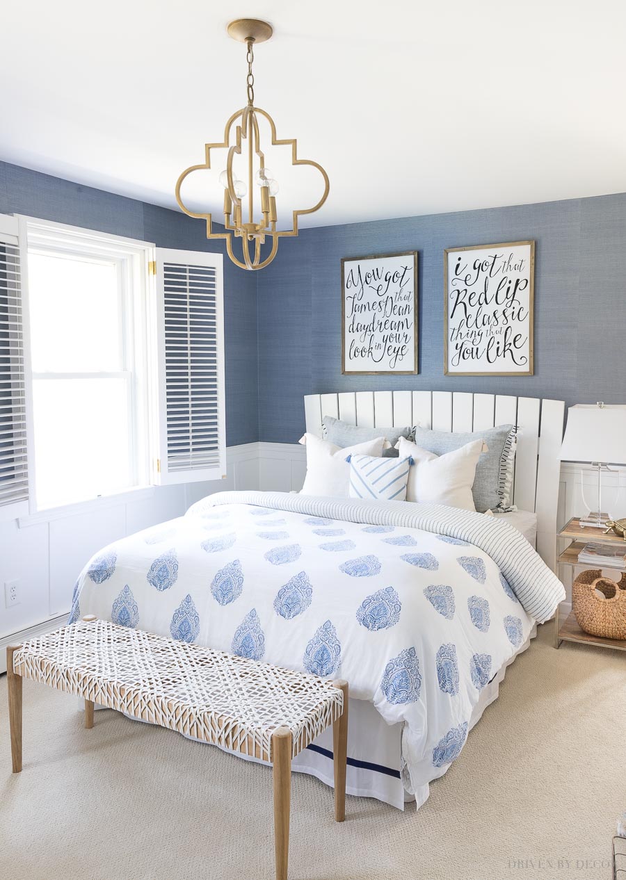
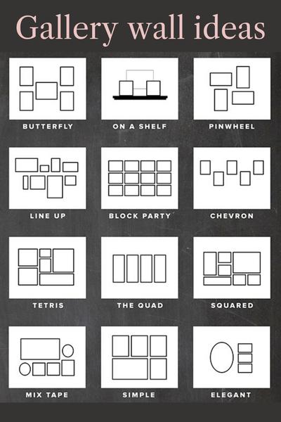
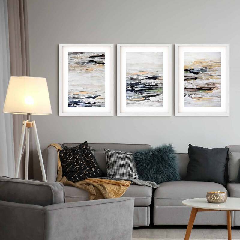
https://autumnlightinteriors.weebly.com/blog/color-exploration-with-roy-g-biv-lets-start-with-red https://autumnlightinteriors.weebly.com/blog/continuing-to-explore-color-with-roy-g-biv-today-orange How high? What size frames? What size matting? How do you group them? What techniques can you use to ensure a minimal swiss cheese affect on your walls? Let's start with some basic guidelines on how to position your art or framed photos.
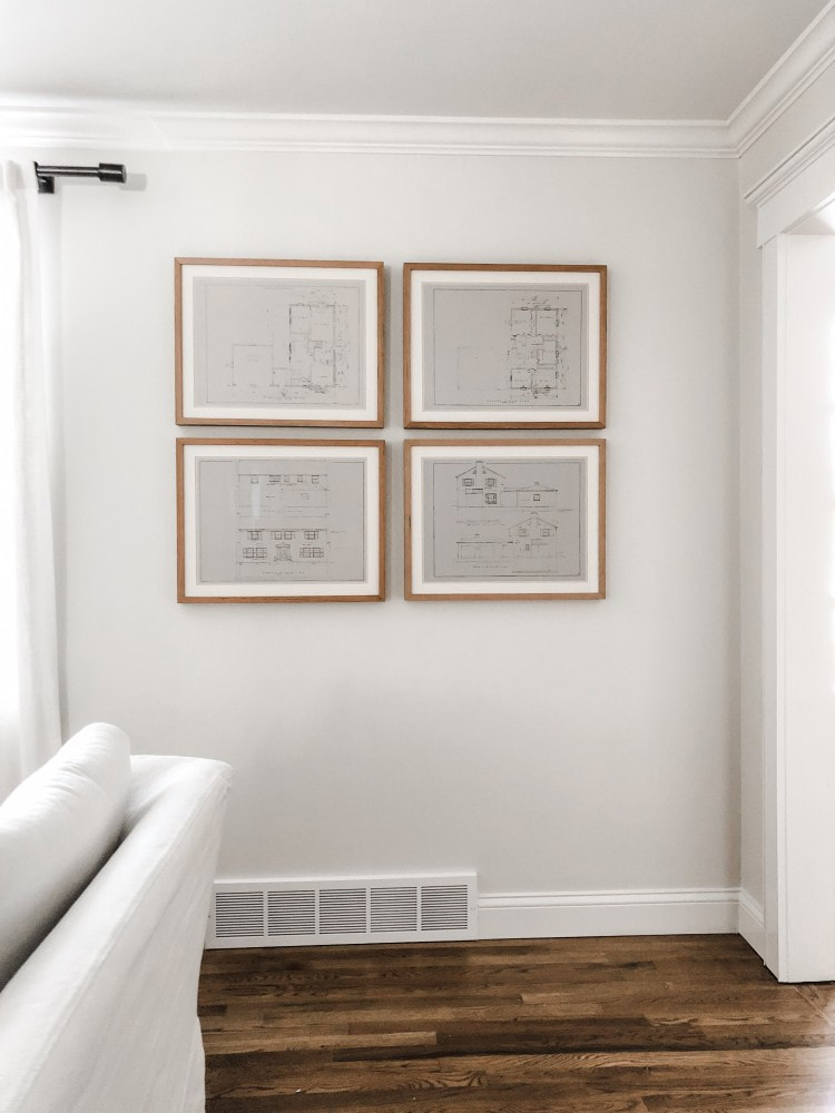
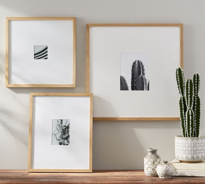
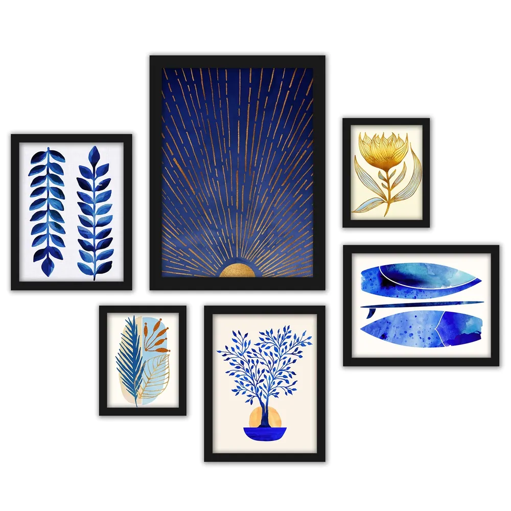
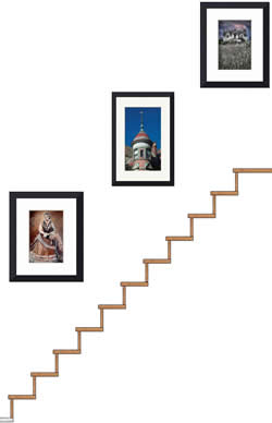
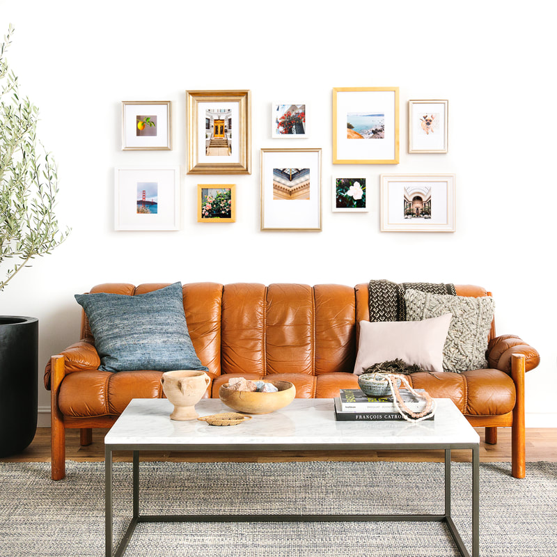
 Now let's smash those guidelines to pieces! Okay, maybe not smash, but let's consider some times when you may want to stray from gallery rules. If you have a space for children, some art can certainly be brought down to a level where they can enjoy it. Or let's say you want to hang some pictures above a headboard that is 57 inches tall. Consider other items in the room like door frames, or shelving. You may be able to consider the difference between the top of the headboard and the top of the door frame as the center point to use for your new center measurement. If your ceilings are not that high the art can be centered between the ceiling and the item above which you are hanging your pictures. 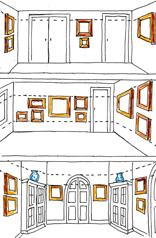 What size should your picture frame(s) be? For drama - as large as you can afford. For collages, you can either vary the sizes of individual frames for added interest or keep the frame size consistent and limit the number to at least 3 but no more than 9 for a more formal, classic look. You can mat your pictures with a standard 3 inch border (put a 5x7 picture in an 8x10 frame, for example). If you have great photos that you don't want to blow up larger or can't due to pixilation, have a frame shop custom cut some matting that will allow you to use much larger frames with your smaller pictures.. If you have more than a few pieces of art or photos to display, grouping them can help you keep your walls from looking cluttered. Think of the space you have for your collage as a large shape within which to arrange your pictures whether that be a square or rectangle. You can play with your designs by arranging the frames on the floor or other large surface. Try aligning the outside edges to form a rectangle within a rectangle (or square within a square). For a long horizontal display, centering varying size frames along one horizontal line and attempting to use the same size frames on each end and in the middle will help give the collage a balanced look. If you have a couple of rows of different size frames, align the bottoms of the top row with the tops of the bottom row to bring your eye pleasingly along the length of the grouping.. Are you arranging pictures along a stairwell? Align the bottom corner of each frame the same distance from the handrail to give a diagonal line that follows along as you go up or down.
Here are a few recommendations to help keep you from creating multiple nail holes in your walls.
I hope this helps give you confidence to hang your art and/or photos of loved ones. Our spaces are meant to house the things we love and those things are meant to be seen and enjoyed. Have fun and, as usual, let me know how it goes!
Just a quick post today brought to you by the color Orange! What's more organic than oranges? Orange might not be the color for everyone, but it sure brings energy and warmth when added to your home whether inside or out. It works well with mid-century modern styling and transitional spaces. 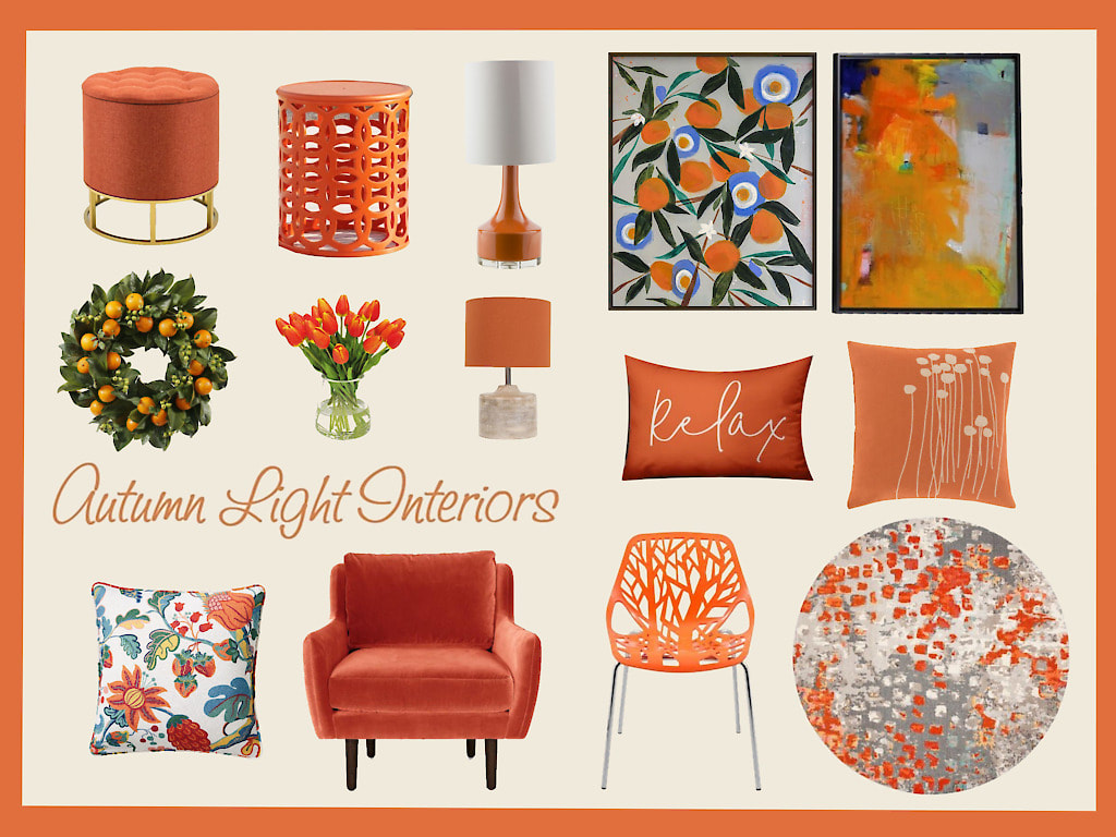 If you would like links to these items, let me know.
|

Photo by Miriam Bulcher Photography
Meet Your DesignerI, Brenda Szarek, am the founder of Autumn Light Interiors. I have immersed myself in home design and problem solving for years and have creative solutions for all kinds of interior design dilemmas. I hope you enjoy my tips, tricks, trends, and inspiration to help you find your way to a well-designed, comfortable, and functional home you can be excited to live in and welcome others within. Archives
July 2024
|


 RSS Feed
